Sass
Css pre-processor, 복잡한 작업을 쉽게 할 수 있게 해주고 코드의 재활용성과 가독성을 높여준다
두가지의 확장자 (.scss/ .sass) 를 지원한다
/* sass */
$font-stack:    Helvetica, sans-serif
$primary-color: #333

body
  font: 100% $font-stack
  color: $primary-color
/* scss */
$font-stack: Helvetica, sans-serif;
$primary-color: #333;
body {
font: 100% $font-stack;
color: $primary-color;
}
1. 시작하기
$ npx create-react-app styling-with-sas
$ cd styling-with-sass
$ npm install node-sass

yarn 대신 npm을 사용했다
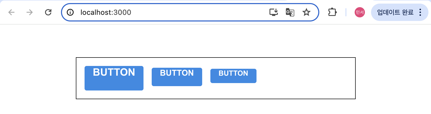
2. Button 컴포넌트 만들고 Sass로 스타일링 하기
//Button.js
import React from 'react';
import './Button.scss';

const Button = ({ children }) => {
  return <button className="Button">{children}</button>;
}

export default Button;
// Button.scss
$blue: #228be6; // 주석 선언
.Button {
display: inline-flex;
color: white;
font-weight: bold;
outline: none;
border-radius: 4px;
border: none;
cursor: pointer;
height: 2.25rem;
padding-left: 1rem;
padding-right: 1rem;
font-size: 1rem;
background: $blue; // 주석 사용
&:hover {
background: lighten($blue, 10%); // 색상 10% 밝게
}
&:active {
background: darken($blue, 10%); // 색상 10% 어둡게
}
}- 스타일 파일에서 사용 할 수 있는 변수 선언 가능
- lighten() 또는 darken()과 같은 함수 사용 가능
// App.js
import React from 'react';
import './App.scss';
import Button from './components/Button';

const App = () => {
  return (
    <div className="App">
      <div className="buttons">
        <Button>BUTTON</Button>
      </div>
    </div>
  );
}

export default App;
//App.scss
.App {
width: 512px;
margin: 0 auto;
margin-top: 4rem;
border: 1px solid black;
padding: 1rem;
}
3. 버튼 사이즈 조정하기
import React from 'react';
import './Button.scss';

const Button = ({ children, size }) => {
  return <button className={['Button', size].join(' ')}>{children}</button>;
}

Button.defaultProps = {
  size: 'medium'
};

export default Button;
defaultProps를 이용
className에 CSS 클래스 이름을 동적으로 넣어주고 싶을 땐
className={['Button', size].join(' ')}또는
className={`Button ${size}`}하지만 문자열을 직접 조합해주는 것보다 classnames 라이브러리를 사용하는 것이 편하다
4. classnames 라이브러리 사용하기

//Button.js
import React from 'react';
import classNames from 'classnames';
import './Button.scss';

const Button=({ children, size })=> {
  return <button className={classNames('Button', size)}>{children}</button>;
}

Button.defaultProps = {
  size: 'medium'
};

export default Button;
$blue: #228be6;
.Button {
display: inline-flex;
color: white;
font-weight: bold;
outline: none;
border-radius: 4px;
border: none;
cursor: pointer;
// 사이즈 관리
&.large {
height: 3rem;
padding-left: 1rem;
padding-right: 1rem;
font-size: 1.25rem;
}
&.medium {
height: 2.25rem;
padding-left: 1rem;
padding-right: 1rem;
font-size: 1rem;
}
&.small {
height: 1.75rem;
font-size: 0.875rem;
padding-left: 1rem;
padding-right: 1rem;
}
background: $blue;
&:hover {
background: lighten($blue, 10%);
}
&:active {
background: darken($blue, 10%);
}
& + & {
margin-left: 1rem;
}
}위의 코드에서
.Button {
  &.large {

  }
}
는
.Button.large {

}
를 의미한다
& + & 는 .Button + .Button을 의미한다
App.js에서도 버튼들을 모두 렌더링해주면
5. mixin
반복이 되는 코드를 mixin을 통해 쉽게 재사용 할 수 있다
$blue: #228be6;
$gray: #495057;
$pink: #f06595;

@mixin button-color($color) {
  background: $color;
  &:hover {
    background: lighten($color, 10%);
  }
  &:active {
    background: darken($color, 10%);
  }
}

.Button {
  display: inline-flex;
  color: white;
  font-weight: bold;
  outline: none;
  border-radius: 4px;
  border: none;
  cursor: pointer;

  // 사이즈 관리
  &.large {
    height: 3rem;
    padding-left: 1rem;
    padding-right: 1rem;
    font-size: 1.25rem;
  }

  &.medium {
    height: 2.25rem;
    padding-left: 1rem;
    padding-right: 1rem;
    font-size: 1rem;
  }

  &.small {
    height: 1.75rem;
    font-size: 0.875rem;
    padding-left: 1rem;
    padding-right: 1rem;
  }

  // 색상 관리
  &.blue {
    @include button-color($blue);
  }

  &.gray {
    @include button-color($gray);
  }

  &.pink {
    @include button-color($pink);
  }

  & + & {
    margin-left: 1rem;
  }
}
6. outline 옵션 만들기
//Button.js
import React from 'react';
import classNames from 'classnames';
import './Button.scss';

const Button = ({ children, size, color, outline })=> {
  return (
    <button className={classNames('Button', size, color, { outline })}>
      {children}
    </button>
  );
}

Button.defaultProps = {
  size: 'medium',
  color: 'blue'
};

export default Button;
outline 값이 true 일 때에만 button에 outline CSS 클래스가 적용된다

6. ...rest props 전달하기
spread 와 rest를 사용하자
import React from 'react';
import classNames from 'classnames';
import './Button.scss';

const Button = ({ children, size, color, outline, fullWidth, ...rest }) => {
  return (
    <button
      className={classNames('Button', size, color, { outline, fullWidth })}
      {...rest}
    >
      {children}
    </button>
  );
}

Button.defaultProps = {
  size: 'medium',
  color: 'blue'
};

export default Button;
...rest로 지정한 props를 제외한 값들을 rest 객체에 모아주고, <button> 태그에 {...rest}를 해준다
=> rest 안에 있는 객체 안에 있는 값들을 모두 <button> 태그에 설정해줌
CSS Module
CSS 클래스가 중첩되는 것을 완벽히 방지할 수 있다
CRA 로 만든 프로젝트에서 CSS Module을 사용할 때는 파일의 확장자를 .module.css로 한다
CSS Moudle 기술을 사용해 커스텀 체크박스 컴포넌트를 만들어보자
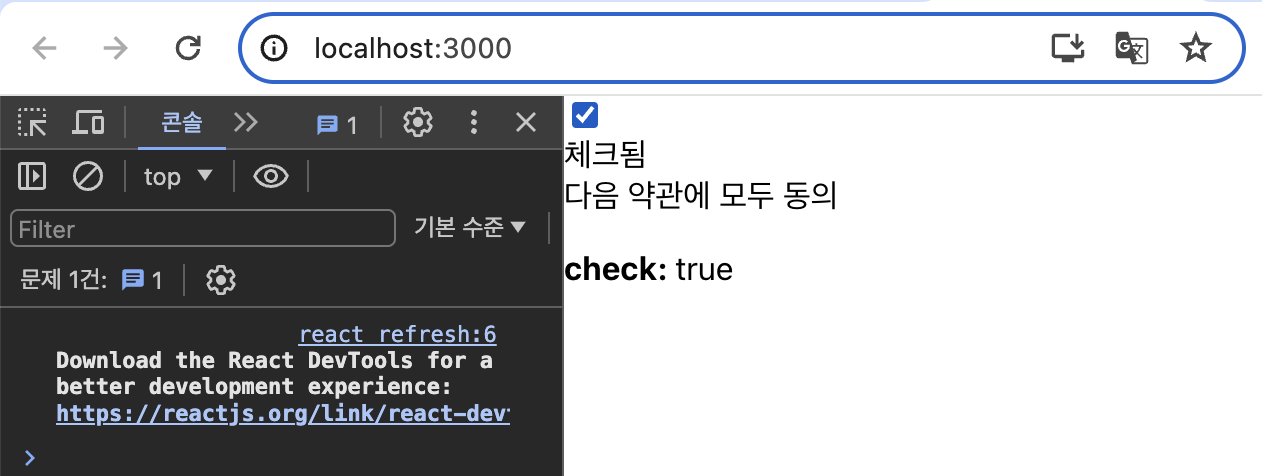
컴포넌트에 필요한 HTML 태그만 미리 선언하고 App 컴포넌트에서 렌더링했다
react-icons라는 라이브러리를 사용하면 Font Awesome, Ionicons, Material Design Icons, 등의 아이콘들을 컴포넌트 형태로 쉽게 사용 할 수 있다
/* CheckBox.module.css */
.checkbox {
  display: flex;
  align-items: center;
}

.checkbox label {
  cursor: pointer;
}

/* 실제 input 을 숨기기 위한 코드 */
.checkbox input {
  width: 0;
  height: 0;
  position: absolute;
  opacity: 0;
}

.checkbox span {
  font-size: 1.125rem;
  font-weight: bold;
}

.icon {
  display: flex;
  align-items: center;
  /* 아이콘의 크기는 폰트 사이즈로 조정 가능 */
  font-size: 2rem;
  margin-right: 0.25rem;
  color: #adb5bd;
}

.checked {
  color: #339af0;
}
CSS Module을 작성할 때에는 CSS 클래스 이름이 중복될 일이 없다

고유한 클래스 이름이 만들어졌다
CSS Module을 사용할 때
- 클래스 이름에 - 가 들어가 있으면 styles['my-class']
- 여러개가 있으면 ${styles.one} ${styles.two}
=>조건부 스타일링을 해야 한다면 더욱 번거로움
classnames의 bind 기능을 사용하면 cx('클래스이름')과 같은 형식으로 CSS 클래스 이름을 지정할 수 있다
클래스 이름을 전역적 클래스이름으로 사용하고 싶을 때는
:global .my-global-name {

}
Sass 버전
:global {
  .my-global-name {

  }
}
CSS Module 을 사용하지 않는 곳에서 특정 클래스에서만 고유 이름을 만들고싶다면
:local .make-this-local {

}
Sass 버전
:local {
  .make-this-local {

  }
}
styled-components
CSS in JS - JS 안에 CSS 를 작성하는 것
styled-components는 CSS in JS 관련 리액트 라이브러리 중에 가장 인기 있는 라이브러리이다
// App.js
import React from 'react';
import styled from 'styled-components';

const Circle = styled.div`
  width: 5rem;
  height: 5rem;
  background: black;
  border-radius: 50%;
`;

const App = () => {
  return <Circle />;
}

export default App;
스타일을 입력함과 동시에 스타일을 가진 컴포넌트를 만들 수 있다
CSS in JS에서 polished 라이브러리를 사용하면 Saas에서 사용한 lighten()과 같은 유틸 함수와 비슷한 함수를 사용할 수 있다
ThemeProvider 로 전역적인 값을 설정할 수 있다 => props.theme 로 조회 가능
1. Dialog 만들기
h3, p를 스타일링 할 때 따로 컴포넌트를 만들어주지 않아도
const DialogBlock = styled.div`
  h3 {}
  p {}
`;
이렇게 작성할 수 있다
- ThemeProvider 내부는 하나의 엘리먼트로 감싸져있어야 한다
- 컴포넌트의 스타일을 커스터마이징 할 때에는 해당 컴포넌트에서 className props를 내부 엘리먼트에게 전달이 되고 있는지 확인해야한다
2. 트랜지션 구현하기
CSS Keyframe을 사용하며, styled-components에서 사용할 때에는 keyframes를 사용한다
사라지는 효과를 구현할 때는 Dialog 컴포넌트에서 두 개의 로컬 상태를 관리해야하는데,
하나는 현재 트랜지션 효과를 보여주고 있는 중이라는 상태를 의미하는 animate
나머지 하나는 실제로 컴포넌트가 사라지는 시점을 지연시키기 위한 localVisivle 값이다
useEffect로 visible 값이 true에서 false로 바뀌는 시점을 감지해 animate 값을 true로 바꿔주고
setTimeout 함수를 이용해 250ms 이후 false로 바꾸어준다
'WINK-(Web & App) > React.js 스터디' 카테고리의 다른 글
| [2024 여름방학 React.js 스터디] 이가인 #5주차 (0) | 2024.08.09 |
|---|---|
| [2024 여름방학 React.js 스터디] 김태일 #5주차 "리액트 컴포넌트 스타일링" (0) | 2024.08.09 |
| [2024 여름방학 React.js 스터디] 이종윤 #5주차 (1) | 2024.08.08 |
| [2024 여름방학 React.js 스터디] 이정욱 #4주차 react 하기 힘들어요 (0) | 2024.08.02 |
| [2024 여름방학 React.js 스터디] 이가인 #4주차 (0) | 2024.08.02 |

