2장. 리액트 컴포넌트 스타일링하기
- 리액트에서 컴포넌트를 스타일링 하는 가장 기본적인 방법은 css 파일을 만들어서 import해서 사용하는 것
- 컴포넌트를 스타일링 할 때 자주 사용되는 기술들: Sass, CSS Module, styled-components
01. Sass
: CSS pre-processor, 복잡한 작업 쉽게 가능, 코드 재활용성.가독성 높여줌, 유지보수 쉬움
- .scss, .sass 두 가지 확장자가 있음, 보통 scss 문법이 더 많이 사용되므로 .scss 확장자로 작성하겠음
- 새로운 리액트 프로젝트 만들고 node-sass 라이브러리 설치하기

- Button 컴포넌트 만들기
- src 디렉토리에 components 디렉토리를 생성 후 그 안에 Button.js 만들기
- Button.scss
- App.js
import React from 'react';
import './App.scss';
import Button from './components/Button';

function App() {
  return (
    <div className="App">
      <div className="buttons">
        <Button>BUTTON</Button>
      </div>
    </div>
  );
}

export default App;
- 기존의 App.css를 App.scss로 이름을 수정한 뒤 코드 작성
.App {
width: 512px;
margin: 0 auto;
margin-top: 4rem;
border: 1px solid black;
padding: 1rem;
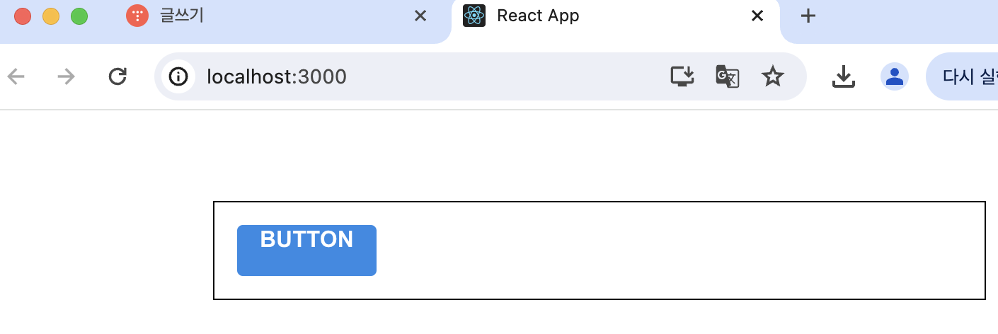
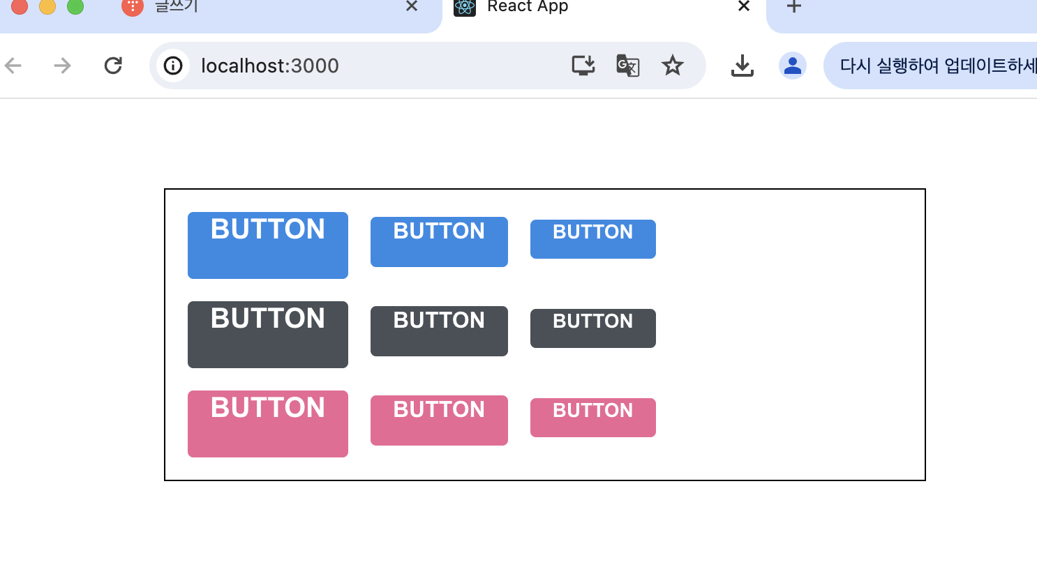
}- 버튼 생김!!
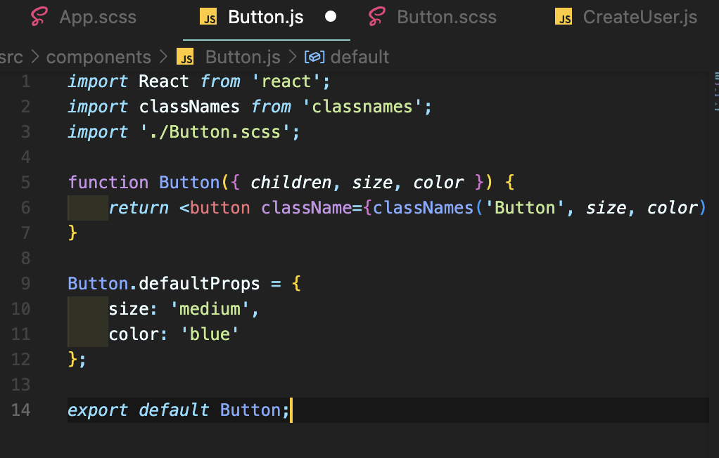
- 버튼 사이즈 조정하기
- Button.js에서 defaultProps를 통하여 size 기본값을 medium으로 설정하고, button의 className에 넣기
import React from 'react';
import './Button.scss';

function Button({ children, size }) {
  return <button className={['Button', size].join(' ')}>{children}</button>;
}

Button.defaultProps = {
  size: 'medium'
};

export default Button;
- className에 CSS 클래스 이름을 동적으로 넣어주고 싶으면
className={['Button', size].join(' ')} //이렇게 또는
className={`Button ${size}`} //이렇게!!
- 하지만 조건부로 CSS 클래스를 넣어주고 싶을 때는 classnames라는 라이브러리를 사용하는 것이 훨씬 편함
- classNames를 사용하면 조건부 스타일링을 할 때 함수의 인자에 문자열, 배열, 객체 등을 전달하여 손쉽게 문자열 조합 가능
classNames('a', 'b'); //=> 'a b'
classNames('a', {b: true}); //=> 'a b'
classNames({'a-b': true}); //=> 'a-b'
classNames({'a-b': false}); //=> ' '
//동시에 여러개 타입 받아오는 것도 가능
classNames('a', {b:ture, c:false}, 'd', {e: true}); //=> 'a b d e'
// false, null, 0, undefined는 무시됨
classNames(null, false, 'a', undefined, 0, 1, {b: null}, ''); //=> 'a 1'
- classnames 프로젝트에 설치하기
$ yarn add classnamesimport classNames from 'classnames'; //Button.js에 추가- 이제 props로 받은 props 값이 button 태그의 className으로 전달됨
- Button.scss에서 다른 크기 지정하기
$blue: #228be6;

.Button {
  display: inline-flex;
  color: white;
  font-weight: bold;
  outline: none;
  border-radius: 4px;
  border: none;
  cursor: pointer;

  // 사이즈 관리
  &.large {
    height: 3rem;
    padding-left: 1rem;
    padding-right: 1rem;
    font-size: 1.25rem;
  }

  &.medium {
    height: 2.25rem;
    padding-left: 1rem;
    padding-right: 1rem;
    font-size: 1rem;
  }

  &.small {
    height: 1.75rem;
    font-size: 0.875rem;
    padding-left: 1rem;
    padding-right: 1rem;
  }

  background: $blue;
  &:hover {
    background: lighten($blue, 10%);
  }

  &:active {
    background: darken($blue, 10%);
  }
}
.Button {
&.large {
}
} //가 의미하는 것은
.Button.large {
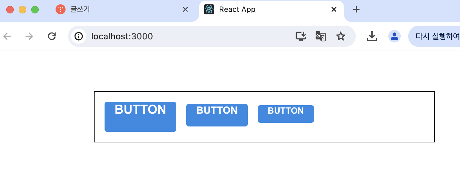
} //이다. Button과 large CSS 클래스가 함께 적용되어 있으면 우리가 원하는 스타일을 적용하겠다는 의미- App.js에서 button 두 개 더 렌더링하고 size값 설정
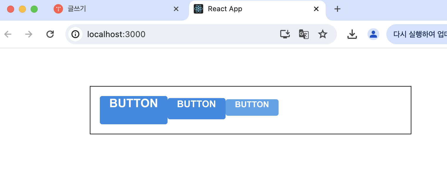
- 버튼들 사이에 여백 설정
$blue: #228be6;

.Button {
  display: inline-flex;
  color: white;
  font-weight: bold;
  outline: none;
  border-radius: 4px;
  border: none;
  cursor: pointer;

  // 사이즈 관리
  &.large {
    height: 3rem;
    padding-left: 1rem;
    padding-right: 1rem;
    font-size: 1.25rem;
  }

  &.medium {
    height: 2.25rem;
    padding-left: 1rem;
    padding-right: 1rem;
    font-size: 1rem;
  }

  &.small {
    height: 1.75rem;
    font-size: 0.875rem;
    padding-left: 1rem;
    padding-right: 1rem;
  }

  background: $blue;
  &:hover {
    background: lighten($blue, 10%);
  }

  &:active {
    background: darken($blue, 10%);
  }

  & + & {
    margin-left: 1rem;
  }
}
- & + &는 .Button + .Button을 의미
- 버튼 색상 설정하기
- Button에서 color라는 props를 받아올 수 있도록 해주고 기본값을 blue로 설정, color값 className에 포함시키기
- Button.scss 파일 수정
$blue: #228be6;
$gray: #495057;
$pink: #f06595;

.Button {
  display: inline-flex;
  color: white;
  font-weight: bold;
  outline: none;
  border-radius: 4px;
  border: none;
  cursor: pointer;

  // 사이즈 관리
  &.large {
    height: 3rem;
    padding-left: 1rem;
    padding-right: 1rem;
    font-size: 1.25rem;
  }

  &.medium {
    height: 2.25rem;
    padding-left: 1rem;
    padding-right: 1rem;
    font-size: 1rem;
  }

  &.small {
    height: 1.75rem;
    font-size: 0.875rem;
    padding-left: 1rem;
    padding-right: 1rem;
  }

  // 색상 관리
  &.blue {
    background: $blue;
    &:hover {
      background: lighten($blue, 10%);
    }

    &:active {
      background: darken($blue, 10%);
    }
  }

  &.gray {
    background: $gray;
    &:hover {
      background: lighten($gray, 10%);
    }

    &:active {
      background: darken($gray, 10%);
    }
  }

  &.pink {
    background: $pink;
    &:hover {
      background: lighten($pink, 10%);
    }

    &:active {
      background: darken($pink, 10%);
    }
  }

  & + & {
    margin-left: 1rem;
  }
}
- 반복되는 코드는 Sass의 mixin 기능을 사용하여 쉽게 재사용 가능. button-color라는 mixin 만들기!
$blue: #228be6;
$gray: #495057;
$pink: #f06595;

@mixin button-color($color) {
  background: $color;
  &:hover {
    background: lighten($color, 10%);
  }
  &:active {
    background: darken($color, 10%);
  }
}

.Button {
  display: inline-flex;
  color: white;
  font-weight: bold;
  outline: none;
  border-radius: 4px;
  border: none;
  cursor: pointer;

  // 사이즈 관리
  &.large {
    height: 3rem;
    padding-left: 1rem;
    padding-right: 1rem;
    font-size: 1.25rem;
  }

  &.medium {
    height: 2.25rem;
    padding-left: 1rem;
    padding-right: 1rem;
    font-size: 1rem;
  }

  &.small {
    height: 1.75rem;
    font-size: 0.875rem;
    padding-left: 1rem;
    padding-right: 1rem;
  }

  // 색상 관리
  &.blue {
    @include button-color($blue);
  }

  &.gray {
    @include button-color($gray);
  }

  &.pink {
    @include button-color($pink);
  }

  & + & {
    margin-left: 1rem;
  }
} //색상 관리쪽 코드가 깔끔해졌다!
- App 컴포넌트에서 렌더링, App.scss에서 .buttons + .buttons와 margin-top 이용해서 간격 띄우기
- 전체 너비 차지하는 옵션
- fullWidth라는 옵션이 있으면 버튼이 전체 너비를 차지하도록 구현해보기
- Button.js className에 fullWidth 추가
function Button({ children, size, color, outline, fullWidth }) {
  return (
    <button
      className={classNames('Button', size, color, { outline, fullWidth })}
    >
      {children}
    </button>
  );
}
- 스타일 수정
 &.fullWidth {
    width: 100%;
    justify-content: center;
    & + & {
      margin-left: 0;
      margin-top: 1rem;
    }
  }
}
- App 렌더링
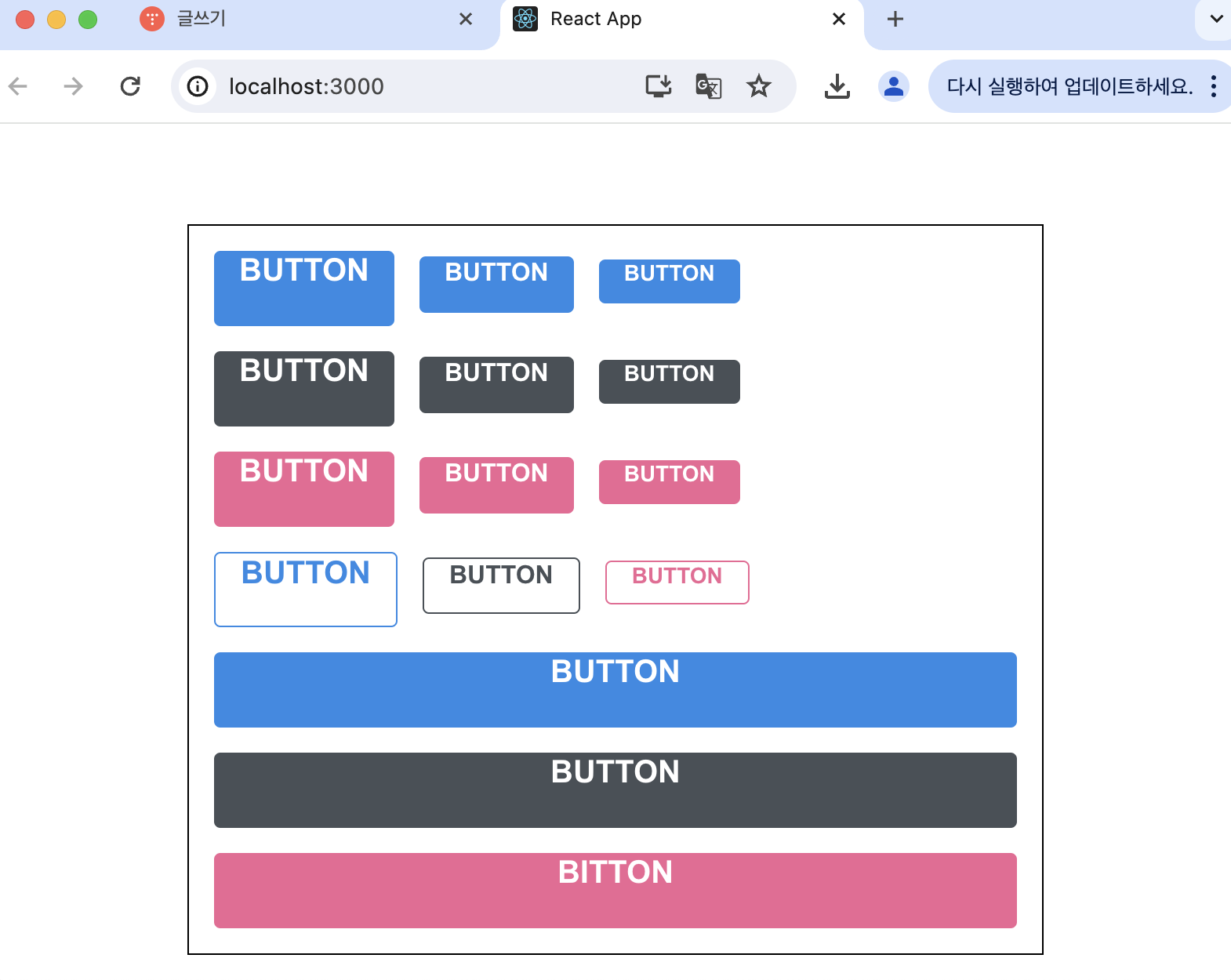
- ...rest props 전달하기
- 컴포넌트에 onClick을 설정해주고 싶다면?
 import classNames from 'classnames';
import './Button.scss';

function Button({ children, size, color, outline, fullWidth, onClick }) {
  return (
    <button
      className={classNames('Button', size, color, { outline, fullWidth })}
      onClick={onClick}
    >
      {children}
    </button>
  );
}

Button.defaultProps = {
  size: 'medium',
  color: 'blue'
};

export default Button;
- onMouseMove 이벤트를 관리하고 싶다면
function Button({ children, size, color, outline, fullWidth, onClick, onMouseMove }) {
  return (
    <button
      className={classNames('Button', size, color, { outline, fullWidth })}
      onClick={onClick}
      onMouseMove={onMouseMove}
    >
      {children}
    </button>
  );
}
- 근데 필요한 이벤트가 있을 때마다 매번 이렇게 넣어주는건 귀찮음... 대신에 spread와 rest 문법을 쓰자!!
import React from 'react';
import classNames from 'classnames';
import './Button.scss';

function Button({ children, size, color, outline, fullWidth, ...rest }) {
  return (
    <button
      className={classNames('Button', size, color, { outline, fullWidth })}
      {...rest}
    >
      {children}
    </button>
  );
}

Button.defaultProps = {
  size: 'medium',
  color: 'blue'
};

export default Button;
- ...rest를 사용해서 지정한 props를 제외한 값들을 rest라는 객체에 모아주고, <button> 태그에 {...rest}를 해주면 rest 안에 있는 객체안에 있는 값들을 모두 <button> 태그에 설정
- 만약 App.js에 있는 첫번째 버튼에 onClick을 설정해준다면
import React from 'react';
import './App.scss';
import Button from './components/Button';

function App() {
  return (
    <div className="App">
      <div className="buttons">
        <Button size="large" onClick={() => console.log('클릭됐다!')}>
          BUTTON
        </Button>
        <Button>BUTTON</Button>
        <Button size="small">BUTTON</Button>
      </div>
      <div className="buttons">
        <Button size="large" color="gray">
          BUTTON
        </Button>
        <Button color="gray">BUTTON</Button>
        <Button size="small" color="gray">
          BUTTON
        </Button>
      </div>
      <div className="buttons">
        <Button size="large" color="pink">
          BUTTON
        </Button>
        <Button color="pink">BUTTON</Button>
        <Button size="small" color="pink">
          BUTTON
        </Button>
      </div>
      <div className="buttons">
        <Button size="large" color="blue" outline>
          BUTTON
        </Button>
        <Button color="gray" outline>
          BUTTON
        </Button>
        <Button size="small" color="pink" outline>
          BUTTON
        </Button>
      </div>
      <div className="buttons">
        <Button size="large" fullWidth>
          BUTTON
        </Button>
        <Button size="large" color="gray" fullWidth>
          BUTTON
        </Button>
        <Button size="large" color="pink" fullWidth>
          BUTTON
        </Button>
      </div>
    </div>
  );
}

export default App;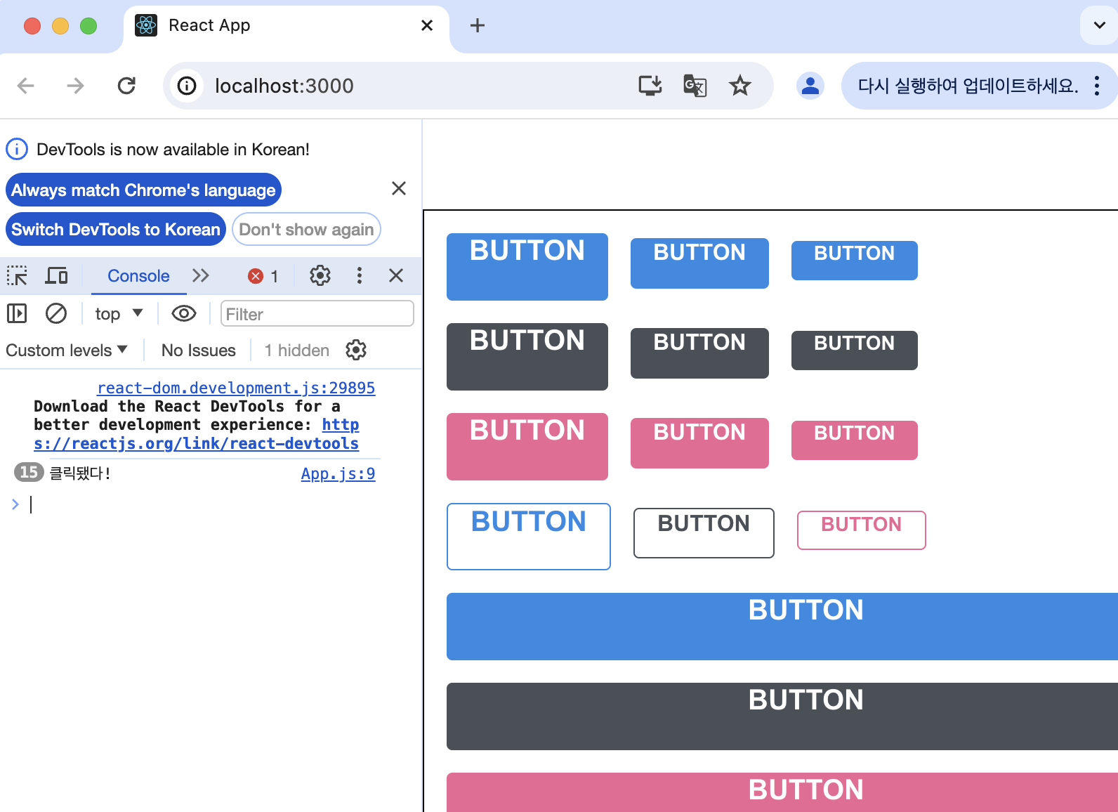
02. CSS Module
- 리액트에서 컴포넌트를 스타일링 할 때 CSS Module을 사용하면 CSS 클래스가 중첩되는 걸 방지할 수 있음
- .module.css 확장자 사용
//Box.module.css
.Box {
  background: black;
  color: white;
  padding: 2rem;
}
//Box.js
import React from "react";
import styles from "./Box.module.css";

function Box() {
  return <div className={styles.Box}>{styles.Box}</div>;
}

export default Box;
- className을 설정할 때에는 import로 불러온 styles 객체 안에 있는 값을 참조해야 함
- 클래스 이름에 대하여 고유한 이름들이 만들어지기 때문에 실수로 CSS 클래스 이름이 다른 관계 없는 곳에서 중복되는 일 걱정 안해두됨
- CSS Module 기술을 사용하여 커스텀 체크박스 컴포넌트를 만들어보자!
- 새 프로젝트 생성
- CSS Module 별도로 설치해야 할 라이브러리 없음!
//CheckBox 컴포넌트 틀 준비
import React from 'react';
function CheckBox({ children, checked, ...rest }) {
return (
<div>
<label>
<input type="checkbox" checked={checked} {...rest} />
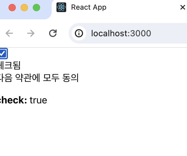
<div>{checked ? '체크됨' : '체크 안됨'}</div>
</label>
<span>{children}</span>
</div>
);
}
export default CheckBox;- App에서 렌더링
import React, { useState } from 'react';

import CheckBox from './components/CheckBox';

function App() {
  const [check, setCheck] = useState(false);
  const onChange = e => {
    setCheck(e.target.checked);
  };
  return (
    <div>
      <CheckBox onChange={onChange} checked={check}>
        다음 약관에 모두 동의
      </CheckBox>
      <p>
        <b>check: </b>
        {check ? 'true' : 'false'}
      </p>
    </div>
  );
}

export default App;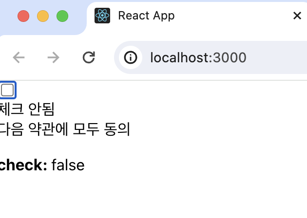
- 스타일링해보자!!
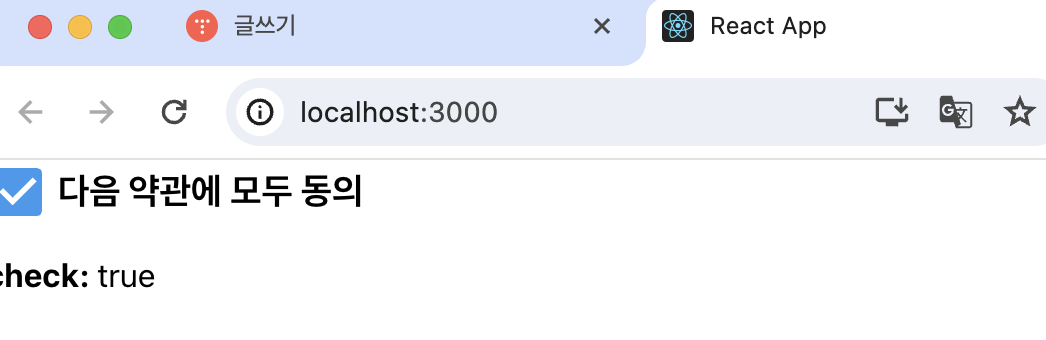
- react-icons 라이브러리 설치하기 (이 라이브러리를 사용하면 다양한 아이콘들을 컴포넌트 형태로 쉽게 사용 가능)
//CheckBox.js
import React from 'react';
import { MdCheckBox, MdCheckBoxOutlineBlank } from 'react-icons/md';

function CheckBox({ children, checked, ...rest }) {
  return (
    <div>
      <label>
        <input type="checkbox" checked={checked} {...rest} />
        <div>{checked ? <MdCheckBox /> : <MdCheckBoxOutlineBlank />}</div>
      </label>
      <span>{children}</span>
    </div>
  );
}

export default CheckBox;//CheckBox.module.css
.checkbox {
display: flex;
align-items: center;
}
.checkbox label {
cursor: pointer;
}
/* 실제 input 을 숨기기 위한 코드 */
.checkbox input {
width: 0;
height: 0;
position: absolute;
opacity: 0;
}
.checkbox span {
font-size: 1.125rem;
font-weight: bold;
}
.icon {
display: flex;
align-items: center;
/* 아이콘의 크기는 폰트 사이즈로 조정 가능 */
font-size: 2rem;
margin-right: 0.25rem;
color: #adb5bd;
}
.checked {
color: #339af0;
}- CSS Module을 작성할 때, CSS 클래스 이름이 다른 곳에서 사용되는 이름과 중복될일이 없기 때문에 짧고 흔한 이름을 사용해도 괜찮음!
//CheckBox.js
import React from 'react';
import { MdCheckBox, MdCheckBoxOutlineBlank } from 'react-icons/md';
import styles from './CheckBox.module.css';

function CheckBox({ children, checked, ...rest }) {
  return (
    <div className={styles.checkbox}>
      <label>
        <input type="checkbox" checked={checked} {...rest} />
        <div className={styles.icon}>
          {checked ? (
            <MdCheckBox className={styles.checked} />
          ) : (
            <MdCheckBoxOutlineBlank />
          )}
        </div>
      </label>
      <span>{children}</span>
    </div>
  );
}

export default CheckBox;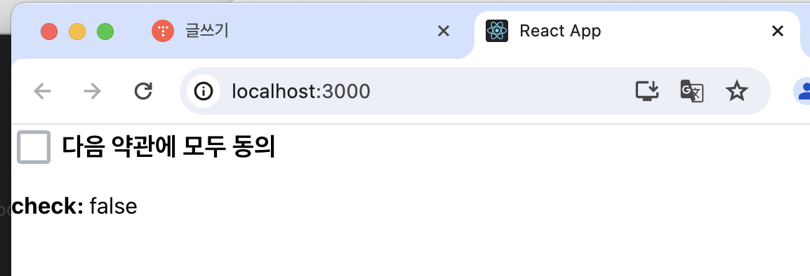
- CSS Module을 사용할 때에는 객체 안에 있는 값을 조회해야 함. 만약 클래스 이름에 - 가 들어있다면 styles['my-class'] 이런 식으로!
- 값이 여러개라면 &{styles.one} ${styles.two} 이런 식으로!!
- 조건부 스타일링을 하려면 ... 넘 복잡함 => classnames 라이브러리에 있는 bind 기능 이용
- classnames의 bind 기능을 사용하면, 클래스 이름을 지정해 줄 때 cx('클래스 이름') 과 같은 형식으로 편하게 사용 가능
cx('one', 'two')
cx('my-component', {
  condition: true
})
cx('my-component', ['another', 'classnames'])
- CSS Module은 Sass에서도 사용할 수 있는데, 그냥 확장자를 .module.scss로 바꿔주면 됨(그 전에 node-sass를 설치해야함)
- CSS Module을 사용하고 있는 파일에서 클래스 이름을 고유화하지 않고 전역적으로 사용하고 싶다면
:global .my-global-name {

} //과 같이 작성하면 됨
:global {
	.my-global-name {

    }
} //Sass에서는 이렇게!
- 반대로 CSS Module 을 사용하지 않는 곳에서 특정 클래스에서만 고유 이름을 만들고 싶다면
:local .make-this-local {

} //이렇게!
:local {
	.make-this-local {

	}
} //Sass에서는 이렇게
03. styled-components
: CSS in JS(JS 안에 CSS 작성)을 사용하는 라이브러리
- Tagged Template Literal
- Template Literal: 내장된 표현식을 허용하는 문자열 리터럴, 문자열 삽입, 여러 줄 문자열, 문자열 형식화, 문자열 태깅 등 다양한 기능을 제공, 백틱으로 감싸줌.
//템플릿 리터럴을 사용하기 전에는 문자열을 삽입할 때
let name = 'wink';
let greeting = 'Hello my name is' + name;
console.log(greeting) // Hello my name is wink
//이런 식으로 썼지만 템플릿 리터럴을 사용한다면
let name = 'wink';
let greeting = `Hello my name is ${name}`; //이런 식으로 쓸 수 있게 되었다 가독성이 조아짐
//템플릿 리터럴을 사용할 때 객체를 넣고싶다면
const object = { a: 1 };
const text = `${object}`
console.log(text); //"[object Object]"
//함수를 넣고 싶다면
const fn = () => true
const msg = `${fn}` ;
console.log(msg); // "() => true"- 템플릿 리터럴을 사용해서 내부에 넣은 자바스크립트 값을 조회하고 싶으면 Tagged Template Literal 문법을 사용
const red = '빨간색';
const blue = '파란색';
function favoriteColors(texts, ...values) {
  console.log(texts);
  console.log(values);
}
favoriteColors`제가 좋아하는 색은 ${red}과 ${blue}입니다.`
- styled-components 사용하기
- 새로운 프로젝트 만들고 styled-components 설치하기
$ npx create-react-app styling-with-styled-components
$ cd styling-with-styled-components
$ yarn add styled-components
- vscode에서 styling-with-styled-components를 열고 그 안에 src에서 작업하기!!!!
- App.js
//App.js
import React from 'react';
import styled from 'styled-components';
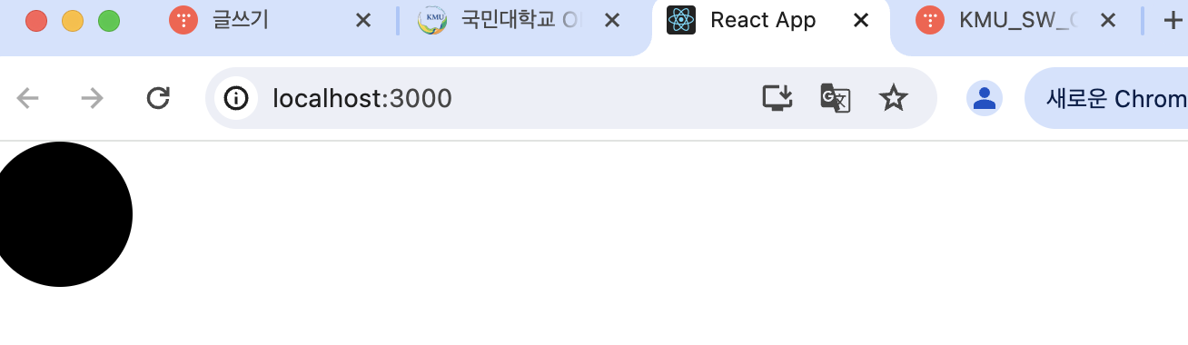
const Circle = styled.div`
width: 5rem;
height: 5rem;
background: black;
border-radius: 50%;
`;
function App() {
return <Circle />;
}
export default App;- 스타일을 입력함과 동시에 해당 스타일을 가진 컴포넌트 생성 가능
- div를 스타일링 하고 싶으면 styled.div, input을 스타일링 하고 싶으면 styled.input ...
- color props 넣기
import React from 'react';
import styled from 'styled-components';

const Circle = styled.div`
    width: 5rem;
    height: 5rem;
    background: ${props => props.color || 'black'};
    border-radius: 50%;
`;

function App() {
    return <Circle color="blue" />;
}

export default App;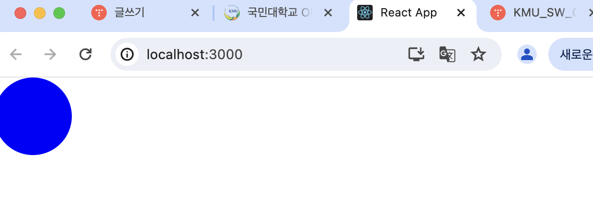
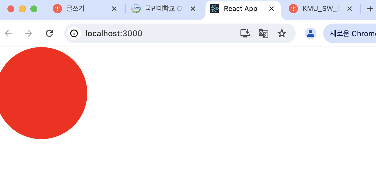
- huge props
import React from 'react';
import styled, { css } from 'styled-components';

const Circle = styled.div`
  width: 5rem;
  height: 5rem;
  background: ${props => props.color || 'black'};
  border-radius: 50%;
  ${props =>
    props.huge &&
    css`
      width: 10rem;
      height: 10rem;
    `}
`;

function App() {
  return <Circle color="red" huge />;
}

export default App;
- 여러 줄의 CSS 코드를 조건부로 보여주고 싶다면 css를 사용
- css를 불러와서 사용을 해야 그 스타일 내부에서도 다른 props 조회 가능
- Button 만들기
// components/Button.js
import React from 'react';
import styled from 'styled-components';

const StyledButton = styled.button`
  /* 공통 스타일 */
  display: inline-flex;
  outline: none;
  border: none;
  border-radius: 4px;
  color: white;
  font-weight: bold;
  cursor: pointer;
  padding-left: 1rem;
  padding-right: 1rem;

  /* 크기 */
  height: 2.25rem;
  font-size: 1rem;

  /* 색상 */
  background: #228be6;
  &:hover {
    background: #339af0;
  }
  &:active {
    background: #1c7ed6;
  }

  /* 기타 */
  & + & {
    margin-left: 1rem;
  }
`;

function Button({ children, ...rest }) {
  return <StyledButton {...rest}>{children}</StyledButton>;
}

export default Button;
//App.js
import React from 'react';
import styled from 'styled-components';
import Button from './components/Button';
const AppBlock = styled.div`
width: 512px;
margin: 0 auto;
margin-top: 4rem;
border: 1px solid black;
padding: 1rem;
`;
function App() {
return (
<AppBlock>
<Button>BUTTON</Button>
</AppBlock>
);
}
export default App;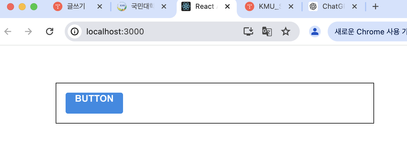
- polished의 스타일 관련 유틸 함수 사용하기
- 패키지 설치하기
$ yarn add polished
- Button.js의 색상 부분을 polished 의 유틸 함수로 대체
import React from 'react';
import styled from 'styled-components';
import { darken, lighten } from 'polished';

const StyledButton = styled.button`
  /* 공통 스타일 */
  display: inline-flex;
  outline: none;
  border: none;
  border-radius: 4px;
  color: white;
  font-weight: bold;
  cursor: pointer;
  padding-left: 1rem;
  padding-right: 1rem;

  /* 크기 */
  height: 2.25rem;
  font-size: 1rem;

  /* 색상 */
  background: #228be6;
  &:hover {
    background: ${lighten(0.1, '#228be6')};
  }
  &:active {
    background: ${darken(0.1, '#228be6')};
  }

  /* 기타 */
  & + & {
    margin-left: 1rem;
  }
`;

function Button({ children, ...rest }) {
  return <StyledButton {...rest}>{children}</StyledButton>;
}

export default Button;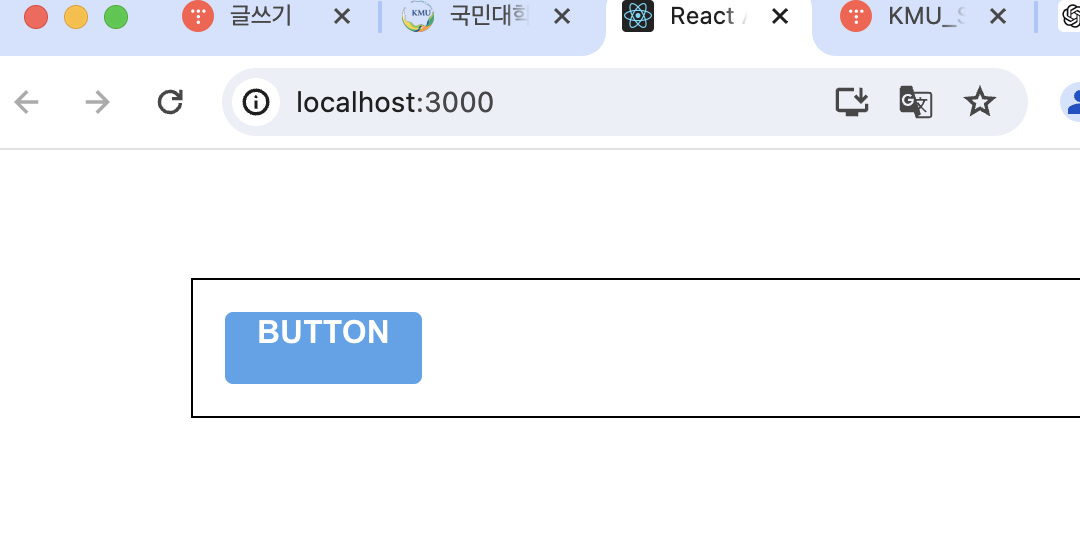
- 색상 코드 변수를 Button.js에서 선언하는 대신에 ThemeProvider 기능을 사용하여 styled-components로 만드는 모든 컴포넌트에서 조회하여 사용할 수 있는 전역적 값 설정해보자
//App.js
import React from 'react';
import styled, { ThemeProvider } from 'styled-components';
import Button from './components/Button';

const AppBlock = styled.div`
  width: 512px;
  margin: 0 auto;
  margin-top: 4rem;
  border: 1px solid black;
  padding: 1rem;
`;

function App() {
  return (
    <ThemeProvider
      theme={{
        palette: {
          blue: '#228be6',
          gray: '#495057',
          pink: '#f06595'
        }
      }}
    >
      <AppBlock>
        <Button>BUTTON</Button>
      </AppBlock>
    </ThemeProvider>
  );
}

export default App;
- 이렇게 theme 을 설정하면 ThemeProvider 내부에 렌더링된 styled-components로 만든 컴포넌트에서 palette를 조회하여 사용할 수 있음
- palette.blue 값 조회해보기
//Button.js
import React from 'react';
import styled, { css } from 'styled-components';
import { darken, lighten } from 'polished';

const StyledButton = styled.button`
  /* 공통 스타일 */
  display: inline-flex;
  outline: none;
  border: none;
  border-radius: 4px;
  color: white;
  font-weight: bold;
  cursor: pointer;
  padding-left: 1rem;
  padding-right: 1rem;

  /* 크기 */
  height: 2.25rem;
  font-size: 1rem;

  /* 색상 */
  ${props => {
    const selected = props.theme.palette.blue;
    return css`
      background: ${selected};
      &:hover {
        background: ${lighten(0.1, selected)};
      }
      &:active {
        background: ${darken(0.1, selected)};
      }
    `;
  }}

  /* 기타 */
  & + & {
    margin-left: 1rem;
  }
`;

function Button({ children, ...rest }) {
  return <StyledButton {...rest}>{children}</StyledButton>;
}

export default Button;
- ThemeProvider로 설정한 값을 styled-components에서 props.theme로 조회할 수 있음.
- selected 값을 Button 컴포넌트가 color props를 통하여 받아오는 색상을 사용하도록 수정해보자
//Button.js
import React from 'react';
import styled, { css } from 'styled-components';
import { darken, lighten } from 'polished';

const StyledButton = styled.button`
  /* 공통 스타일 */
  display: inline-flex;
  outline: none;
  border: none;
  border-radius: 4px;
  color: white;
  font-weight: bold;
  cursor: pointer;
  padding-left: 1rem;
  padding-right: 1rem;

  /* 크기 */
  height: 2.25rem;
  font-size: 1rem;

  /* 색상 */
  ${props => {
    const selected = props.theme.palette[props.color];
    return css`
      background: ${selected};
      &:hover {
        background: ${lighten(0.1, selected)};
      }
      &:active {
        background: ${darken(0.1, selected)};
      }
    `;
  }}

  /* 기타 */
  & + & {
    margin-left: 1rem;
  }
`;

function Button({ children, ...rest }) {
  return <StyledButton {...rest}>{children}</StyledButton>;
}

Button.defaultProps = {
  color: 'blue'
};

export default Button;
- 회색, 핑크색 버튼 렌더링
// App.js
import React from 'react';
import styled, { ThemeProvider } from 'styled-components';
import Button from './components/Button';

const AppBlock = styled.div`
  width: 512px;
  margin: 0 auto;
  margin-top: 4rem;
  border: 1px solid black;
  padding: 1rem;
`;

function App() {
  return (
    <ThemeProvider
      theme={{
        palette: {
          blue: '#228be6',
          gray: '#495057',
          pink: '#f06595'
        }
      }}
    >
      <AppBlock>
        <Button>BUTTON</Button>
        <Button color="gray">BUTTON</Button>
        <Button color="pink">BUTTON</Button>
      </AppBlock>
    </ThemeProvider>
  );
}

export default App;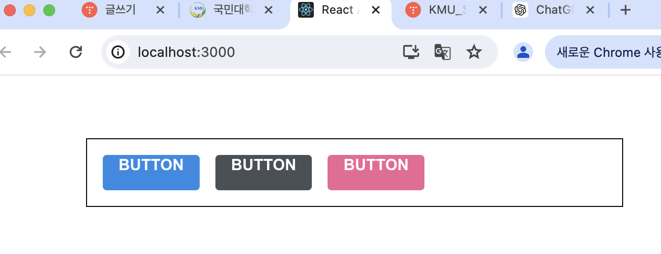
- Button 코드 리팩토링
import React from 'react';
import styled, { css } from 'styled-components';
import { darken, lighten } from 'polished';

const StyledButton = styled.button`
  /* 공통 스타일 */
  display: inline-flex;
  outline: none;
  border: none;
  border-radius: 4px;
  color: white;
  font-weight: bold;
  cursor: pointer;
  padding-left: 1rem;
  padding-right: 1rem;

  /* 크기 */
  height: 2.25rem;
  font-size: 1rem;

  /* 색상 */
  ${({ theme, color }) => {
    const selected = theme.palette[color];
    return css`
      background: ${selected};
      &:hover {
        background: ${lighten(0.1, selected)};
      }
      &:active {
        background: ${darken(0.1, selected)};
      }
    `;
  }}

  /* 기타 */
  & + & {
    margin-left: 1rem;
  }
`;

function Button({ children, color, ...rest }) {
  return <StyledButton color={color} {...rest}>{children}</StyledButton>;
}

Button.defaultProps = {
  color: 'blue'
};

export default Button;
- props.theme.palette.blue를 사용하여 값을 조회하는 대신 비구조화 할당 문법을 사용함 -> 가독성 좋아짐!!
- 색상 관련 코드 분리, size props 설정하여 버튼 크기 다양하게!
import React from 'react';
import styled, { css } from 'styled-components';
import { darken, lighten } from 'polished';

const colorStyles = css`
  ${({ theme, color }) => {
    const selected = theme.palette[color];
    return css`
      background: ${selected};
      &:hover {
        background: ${lighten(0.1, selected)};
      }
      &:active {
        background: ${darken(0.1, selected)};
      }
    `;
  }}
`;

const sizeStyles = css`
  ${props =>
    props.size === 'large' &&
    css`
      height: 3rem;
      font-size: 1.25rem;
    `}

  ${props =>
    props.size === 'medium' &&
    css`
      height: 2.25rem;
      font-size: 1rem;
    `}

    ${props =>
      props.size === 'small' &&
      css`
        height: 1.75rem;
        font-size: 0.875rem;
      `}
`;

const StyledButton = styled.button`
  /* 공통 스타일 */
  display: inline-flex;
  outline: none;
  border: none;
  border-radius: 4px;
  color: white;
  font-weight: bold;
  cursor: pointer;
  padding-left: 1rem;
  padding-right: 1rem;

  /* 크기 */
  ${sizeStyles}

  /* 색상 */
  ${colorStyles}

  /* 기타 */
  & + & {
    margin-left: 1rem;
  }
`;

function Button({ children, color, size,  ...rest }) {
  return (
    <StyledButton color={color} size={size} {...rest}>
      {children}
    </StyledButton>
  );
}

Button.defaultProps = {
  color: 'blue'
};

export default Button;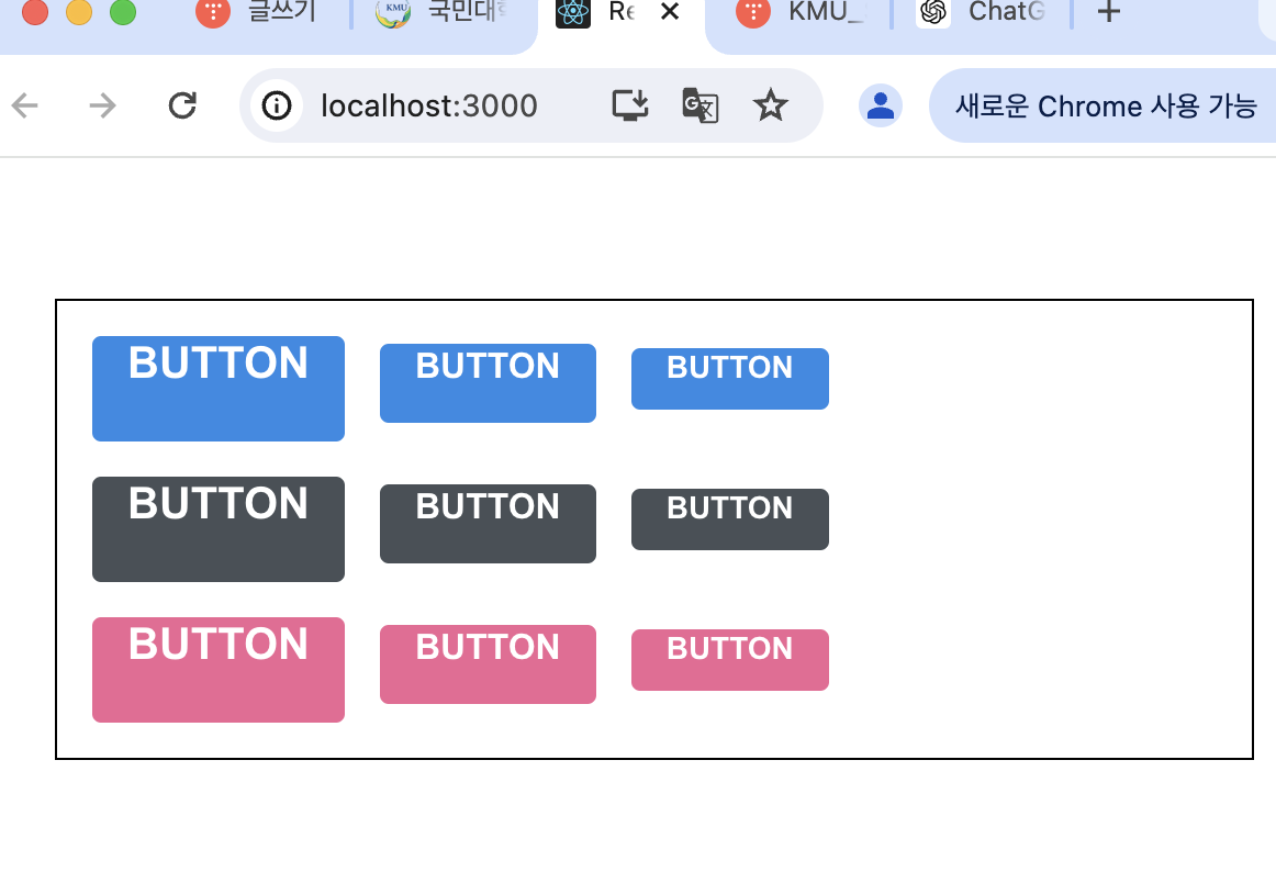
- Button.js 리팩토링
import React from 'react';
import styled, { css } from 'styled-components';
import { darken, lighten } from 'polished';

const colorStyles = css`
  ${({ theme, color }) => {
    const selected = theme.palette[color];
    return css`
      background: ${selected};
      &:hover {
        background: ${lighten(0.1, selected)};
      }
      &:active {
        background: ${darken(0.1, selected)};
      }
    `;
  }}
`;

const sizes = {
  large: {
    height: '3rem',
    fontSize: '1.25rem'
  },
  medium: {
    height: '2.25rem',
    fontSize: '1rem'
  },
  small: {
    height: '1.75rem',
    fontSize: '0.875rem'
  }
};

const sizeStyles = css`
  ${({ size }) => css`
    height: ${sizes[size].height};
    font-size: ${sizes[size].fontSize};
  `}
`;

const StyledButton = styled.button`
  /* 공통 스타일 */
  display: inline-flex;
  outline: none;
  border: none;
  border-radius: 4px;
  color: white;
  font-weight: bold;
  cursor: pointer;
  padding-left: 1rem;
  padding-right: 1rem;

  /* 크기 */
  ${sizeStyles}

  /* 색상 */
  ${colorStyles}

  /* 기타 */
  & + & {
    margin-left: 1rem;
  }
`;

function Button({ children, color, size, ...rest }) {
  return (
    <StyledButton color={color} size={size} {...rest}>
      {children}
    </StyledButton>
  );
}

Button.defaultProps = {
  color: 'blue',
  size: 'medium'
};

export default Button;
- outline props 설정하여 ture일 때만 테두리 보이게 하기
- colorStyles만 수정해주면됨!
import React from 'react';
import styled, { css } from 'styled-components';
import { darken, lighten } from 'polished';
const colorStyles = css`
${({ theme, color }) => {
const selected = theme.palette[color];
return css`
background: ${selected};
&:hover {
background: ${lighten(0.1, selected)};
}
&:active {
background: ${darken(0.1, selected)};
}
${props =>
props.outline &&
css`
color: ${selected};
background: none;
border: 1px solid ${selected};
&:hover {
background: ${selected};
color: white;
}
`}
`;
}}
`;
const sizes = {
large: {
height: '3rem',
fontSize: '1.25rem'
},
medium: {
height: '2.25rem',
fontSize: '1rem'
},
small: {
height: '1.75rem',
fontSize: '0.875rem'
}
};
const sizeStyles = css`
${({ size }) => css`
height: ${sizes[size].height};
font-size: ${sizes[size].fontSize};
`}
`;
const StyledButton = styled.button`
/* 공통 스타일 */
display: inline-flex;
outline: none;
border: none;
border-radius: 4px;
color: white;
font-weight: bold;
cursor: pointer;
padding-left: 1rem;
padding-right: 1rem;
/* 크기 */
${sizeStyles}
/* 색상 */
${colorStyles}
/* 기타 */
& + & {
margin-left: 1rem;
}
`;
function Button({ children, color, size, outline, ...rest }) {
return (
<StyledButton color={color} size={size} outline={outline} {...rest}>
{children}
</StyledButton>
) ;
}
Button.defaultProps = {
color: 'blue',
size: 'medium'
};
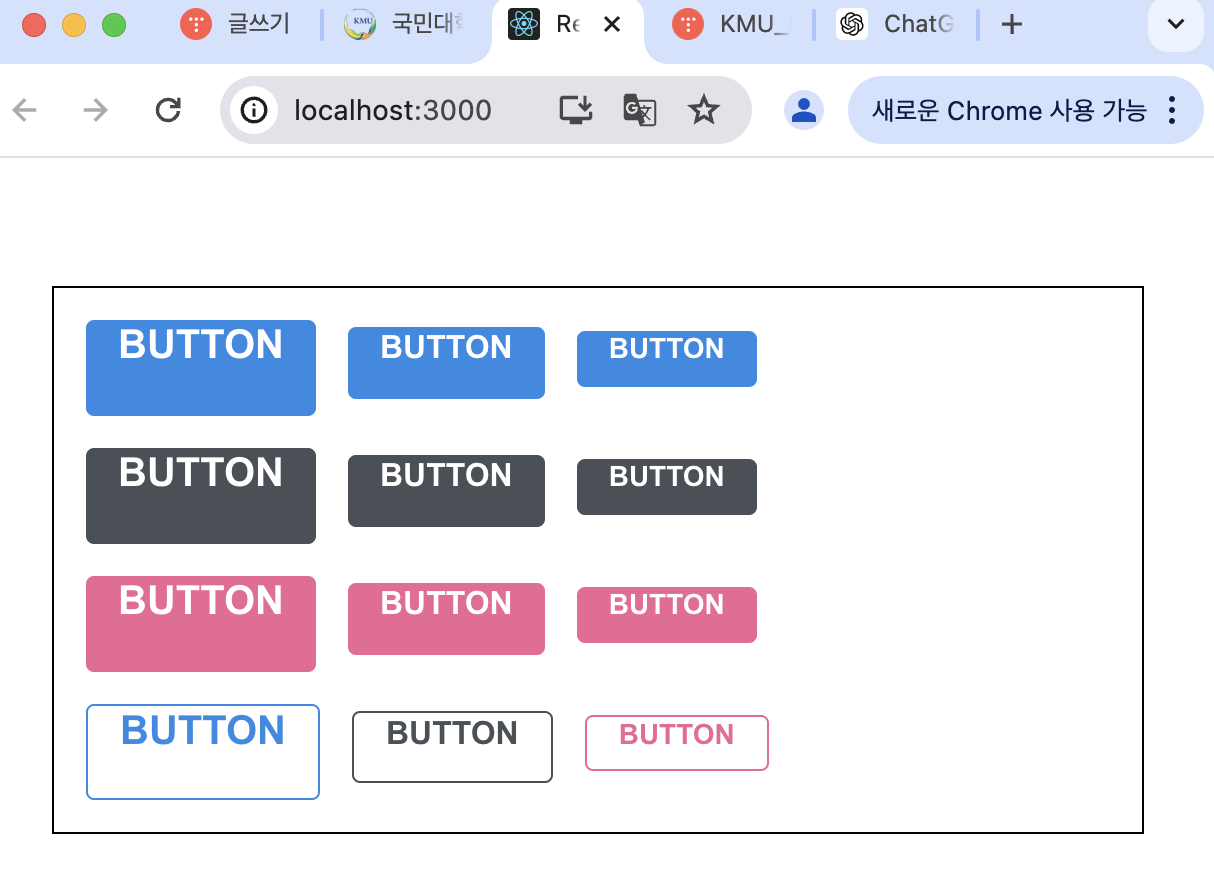
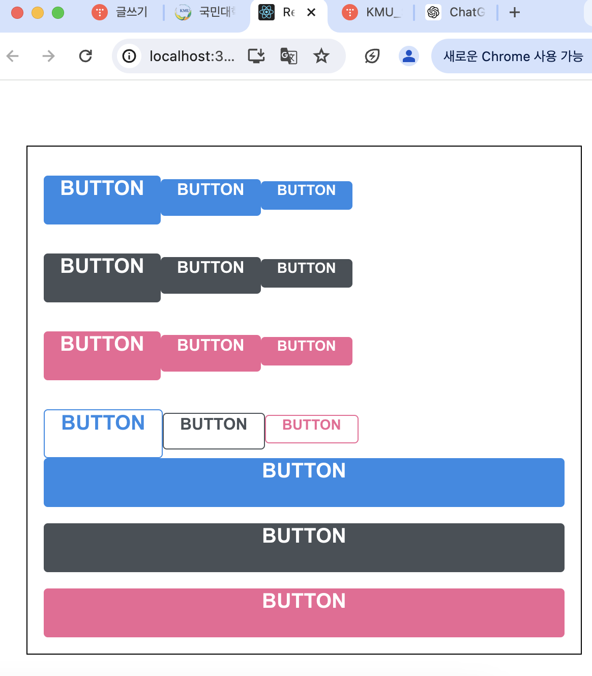
export default Button;- App에서 outline Button 렌더링
- fullWidth props가 주어졌다면 버튼 크기가 100%가 되도록 해보기
import React from 'react';
import styled, { css } from 'styled-components';
import { darken, lighten } from 'polished';

const colorStyles = css`
  ${({ theme, color }) => {
    const selected = theme.palette[color];
    return css`
      background: ${selected};
      &:hover {
        background: ${lighten(0.1, selected)};
      }
      &:active {
        background: ${darken(0.1, selected)};
      }
      ${props =>
        props.outline &&
        css`
          color: ${selected};
          background: none;
          border: 1px solid ${selected};
          &:hover {
            background: ${selected};
            color: white;
          }
        `}
    `;
  }}
`;

const sizes = {
  large: {
    height: '3rem',
    fontSize: '1.25rem'
  },
  medium: {
    height: '2.25rem',
    fontSize: '1rem'
  },
  small: {
    height: '1.75rem',
    fontSize: '0.875rem'
  }
};

const sizeStyles = css`
  ${({ size }) => css`
    height: ${sizes[size].height};
    font-size: ${sizes[size].fontSize};
  `}
`;

const fullWidthStyle = css`
  ${props =>
    props.fullWidth &&
    css`
      width: 100%;
      justify-content: center;
      & + & {
        margin-left: 0;
        margin-top: 1rem;
      }
    `}
`;

const StyledButton = styled.button`
  /* 공통 스타일 */
  display: inline-flex;
  outline: none;
  border: none;
  border-radius: 4px;
  color: white;
  font-weight: bold;
  cursor: pointer;
  padding-left: 1rem;
  padding-right: 1rem;

  /* 크기 */
  ${sizeStyles}

  /* 색상 */
  ${colorStyles}

  /* 기타 */
  & + & {
    margin-left: 1rem;
  }

  ${fullWidthStyle}
`;

function Button({ children, color, size, outline, fullWidth, ...rest }) {
  return (
    <StyledButton
      color={color}
      size={size}
      outline={outline}
      fullWidth={fullWidth}
      {...rest}
    >
      {children}
    </StyledButton>
  );
}

Button.defaultProps = {
  color: 'blue',
  size: 'medium'
};

export default Button;
- App에서 렌더링
- Dialog 만들기
- components 디렉토리에 Dialog.js 파일 생성
import React from 'react';
import styled from 'styled-components';
import Button from './Button';

const DarkBackground = styled.div`
  position: fixed;
  left: 0;
  top: 0;
  width: 100%;
  height: 100%;
  display: flex;
  align-items: center;
  justify-content: center;
  background: rgba(0, 0, 0, 0.8);
`;

const DialogBlock = styled.div`
  width: 320px;
  padding: 1.5rem;
  background: white;
  border-radius: 2px;
  h3 {
    margin: 0;
    font-size: 1.5rem;
  }
  p {
    font-size: 1.125rem;
  }
`;

const ButtonGroup = styled.div`
  margin-top: 3rem;
  display: flex;
  justify-content: flex-end;
`;

function Dialog({ title, children, confirmText, cancelText }) {
  return (
    <DarkBackground>
      <DialogBlock>
        <h3>{title}</h3>
        <p>{children}</p>
        <ButtonGroup>
          <Button color="gray">{cancelText}</Button>
          <Button color="pink">{confirmText}</Button>
        </ButtonGroup>
      </DialogBlock>
    </DarkBackground>
  );
}

Dialog.defaultProps = {
  confirmText: '확인',
  cancelText: '취소'
};

export default Dialog;
- h3, p 스타일링 때 굳이 따로 컴포넌트를 만들어주지 않아도 됨! styled-components에서도 Nested CSS 문법을 사용할 수 있기 때문
- Nested CSS: CSS 선택자를 중첩구조로 사용 가능
const Title = styled.h3``;
const Description = styled.p``; //이렇게 따로 안해주고

const DialogBlock = styled.div`
	h3 {}
    p {}
; //중첩해서 사용 가능!
- App 렌더링
- styled-components 로 컴포넌트 스타일을 특정 상황에서 덮어쓰게 하기
- Dialog.js에서 ShortMarginButton을 만들고 기존 Button 대체하기
import React from 'react';
import styled from 'styled-components';
import Button from './Button';

const DarkBackground = styled.div`
  position: fixed;
  left: 0;
  top: 0;
  width: 100%;
  height: 100%;
  display: flex;
  align-items: center;
  justify-content: center;
  background: rgba(0, 0, 0, 0.8);
`;

const DialogBlock = styled.div`
  width: 320px;
  padding: 1.5rem;
  background: white;
  border-radius: 2px;
  h3 {
    margin: 0;
    font-size: 1.5rem;
  }
  p {
    font-size: 1.125rem;
  }
`;

const ButtonGroup = styled.div`
  margin-top: 3rem;
  display: flex;
  justify-content: flex-end;
`;

const ShortMarginButton = styled(Button)`
  & + & {
    margin-left: 0.5rem;
  }
`;

function Dialog({ title, children, confirmText, cancelText }) {
  return (
    <DarkBackground>
      <DialogBlock>
        <h3>{title}</h3>
        <p>{children}</p>
        <ButtonGroup>
          <ShortMarginButton color="gray">{cancelText}</ShortMarginButton>
          <ShortMarginButton color="pink">{confirmText}</ShortMarginButton>
        </ButtonGroup>
      </DialogBlock>
    </DarkBackground>
  );
}

Dialog.defaultProps = {
  confirmText: '확인',
  cancelText: '취소'
};

export default Dialog;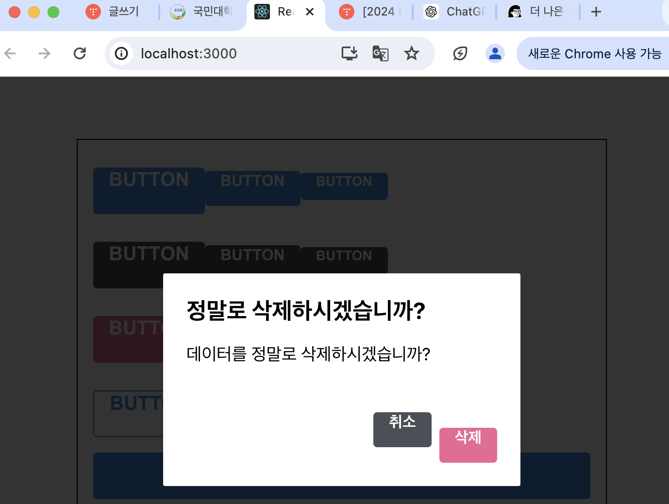
- 컴포넌트의 스타일을 커스터마이징할 때에는 className props를 내부 엘리먼트에게 전달이 되고 있는지 확인해줘야 함
const Mycomponent = ({ className }) => {
	return <div className={className}></div>
};

const ExtendedComponent = styled(MyComponent)`
	background: black;
`;
- 열고 닫을 수 있는 기능 구현
- Dialog에서 onConfirm과 onCancel을 props로 받아오고 해당 함수들을 onClick으로 설정, visible props 받아와서 false일 때 null을 반환하도록 설정
import React from 'react';
import styled from 'styled-components';
import Button from './Button';

const DarkBackground = styled.div`
  position: fixed;
  left: 0;
  top: 0;
  width: 100%;
  height: 100%;
  display: flex;
  align-items: center;
  justify-content: center;
  background: rgba(0, 0, 0, 0.8);
`;

const DialogBlock = styled.div`
  width: 320px;
  padding: 1.5rem;
  background: white;
  border-radius: 2px;
  h3 {
    margin: 0;
    font-size: 1.5rem;
  }
  p {
    font-size: 1.125rem;
  }
`;

const ButtonGroup = styled.div`
  margin-top: 3rem;
  display: flex;
  justify-content: flex-end;
`;

const ShortMarginButton = styled(Button)`
  & + & {
    margin-left: 0.5rem;
  }
`;

function Dialog({
  title,
  children,
  confirmText,
  cancelText,
  onConfirm,
  onCancel,
  visible
}) {
  if (!visible) return null;
  return (
    <DarkBackground>
      <DialogBlock>
        <h3>{title}</h3>
        <p>{children}</p>
        <ButtonGroup>
          <ShortMarginButton color="gray" onClick={onCancel}>
            {cancelText}
          </ShortMarginButton>
          <ShortMarginButton color="pink" onClick={onConfirm}>
            {confirmText}
          </ShortMarginButton>
        </ButtonGroup>
      </DialogBlock>
    </DarkBackground>
  );
}

Dialog.defaultProps = {
  confirmText: '확인',
  cancelText: '취소'
};

export default Dialog;
- App 렌더링
import React, { useState } from 'react';
import styled, { ThemeProvider } from 'styled-components';
import Button from './components/Button';
import Dialog from './components/Dialog';
const AppBlock = styled.div`
width: 512px;
margin: 0 auto;
margin-top: 4rem;
border: 1px solid black;
padding: 1rem;
`;
const ButtonGroup = styled.div`
& + & {
margin-top: 1rem;
}
`;
function App() {
const [dialog, setDialog] = useState(false);
const onClick = () => {
setDialog(true);
};
const onConfirm = () => {
console.log('확인');
setDialog(false);
};
const onCancel = () => {
console.log('취소');
setDialog(false);
};
return (
<ThemeProvider
theme={{
palette: {
blue: '#228be6',
gray: '#495057',
pink: '#f06595'
}
}}
>
<>
<AppBlock>
<ButtonGroup>
<Button size="large">BUTTON</Button>
<Button>BUTTON</Button>
<Button size="small">BUTTON</Button>
</ButtonGroup>
<ButtonGroup>
<Button color="gray" size="large">
BUTTON
</Button>
<Button color="gray">BUTTON</Button>
<Button color="gray" size="small">
BUTTON
</Button>
</ButtonGroup>
<ButtonGroup>
<Button color="pink" size="large">
BUTTON
</Button>
<Button color="pink">BUTTON</Button>
<Button color="pink" size="small">
BUTTON
</Button>
</ButtonGroup>
<ButtonGroup>
<Button size="large" outline>
BUTTON
</Button>
<Button color="gray" outline>
BUTTON
</Button>
<Button color="pink" size="small" outline>
BUTTON
</Button>
</ButtonGroup>
<ButtonGroup>
<Button size="large" fullWidth>
BUTTON
</Button>
<Button size="large" color="gray" fullWidth>
BUTTON
</Button>
<Button size="large" color="pink" fullWidth onClick={onClick}>
삭제
</Button>
</ButtonGroup>
</AppBlock>
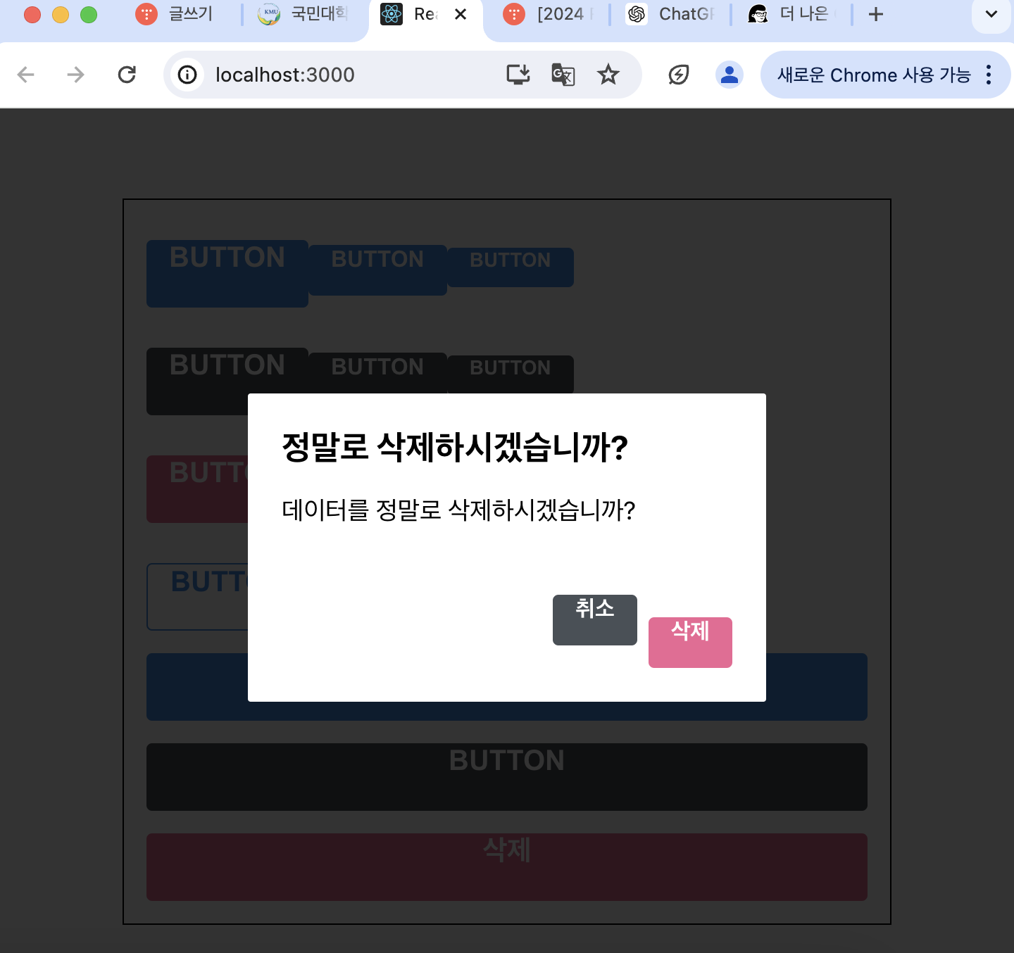
<Dialog
title="정말로 삭제하시겠습니까?"
confirmText="삭제"
cancelText="취소"
onConfirm={onConfirm}
onCancel={onCancel}
visible={dialog}
>
데이터를 정말로 삭제하시겠습니까?
</Dialog>
</>
</ThemeProvider>
);
}
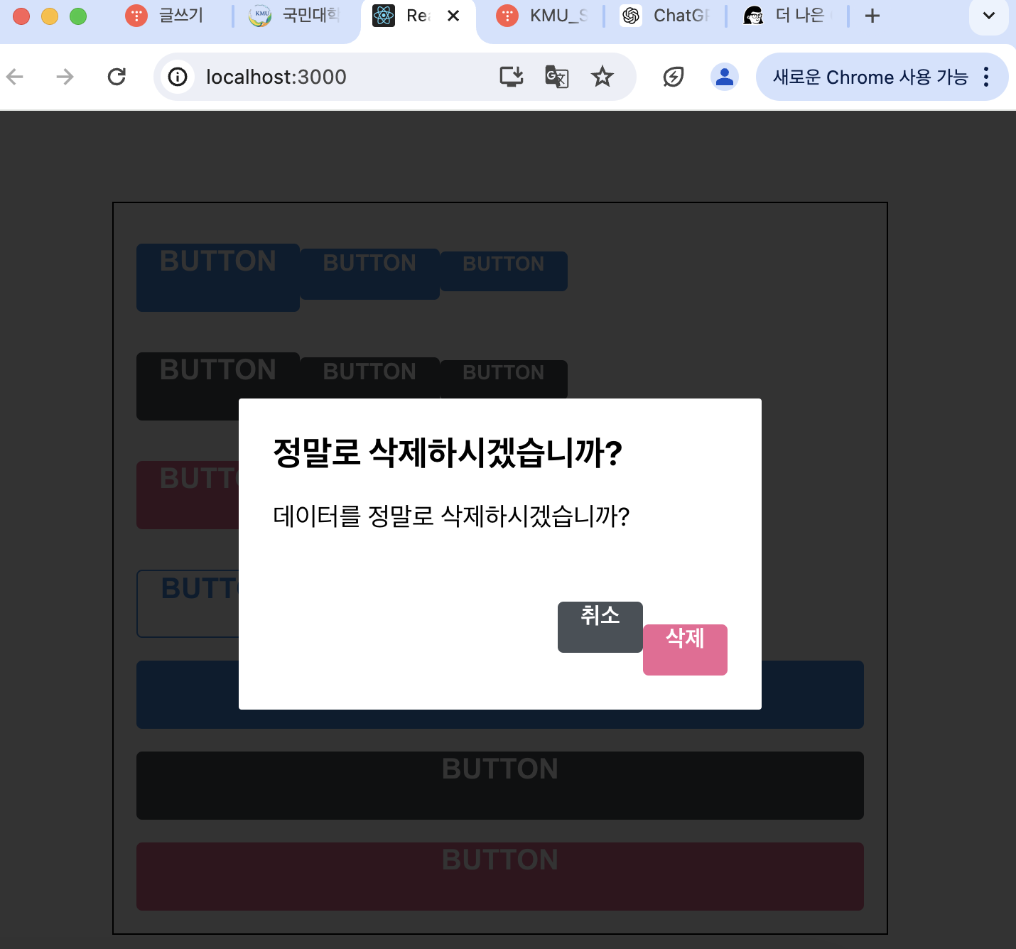
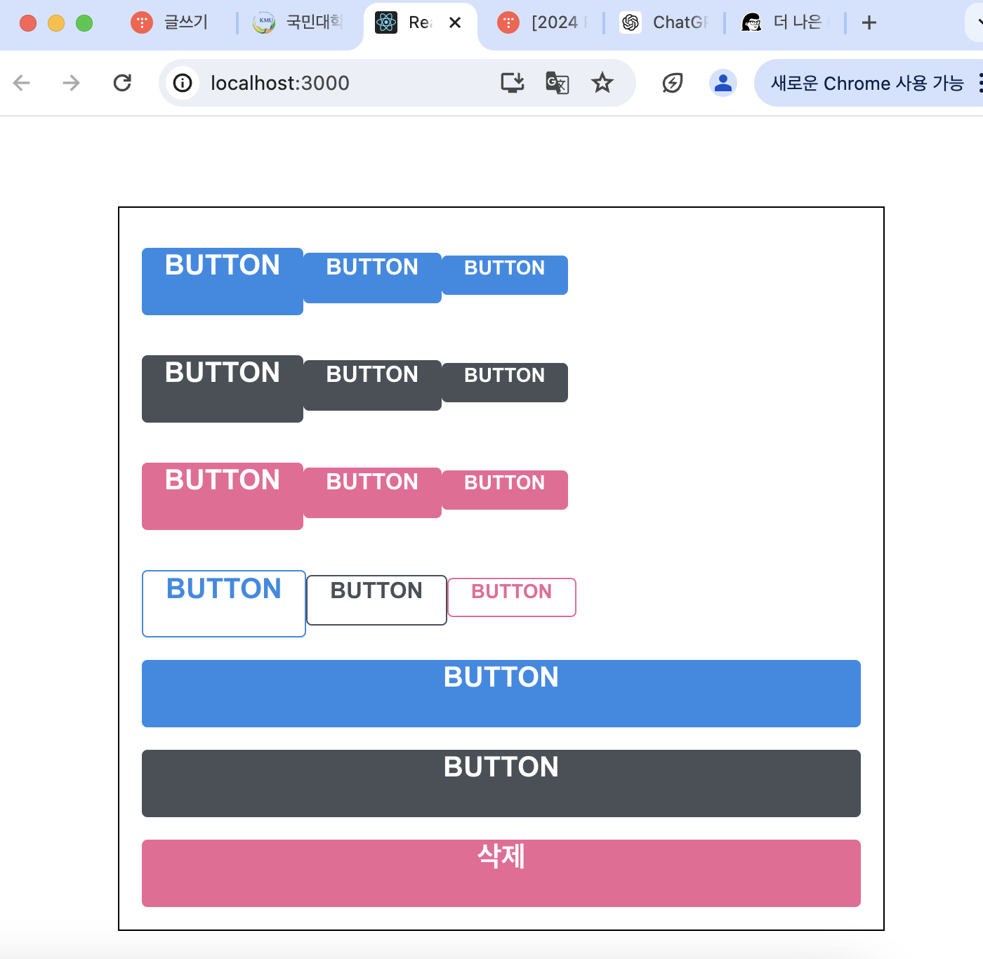
export default App;- 핑크색 버튼의 이름이 "삭제"로 바뀌었으며 버튼을 누르면 우리가 만든 Dialog가 보임
- 트랜지션 구현하기
- 트랜지션 효과를 구현할 때에는 CSS Keyframe을 사용, styled-components에서 사용할 때에는 keyframes 유틸 사용
//Dialog.js
import React from 'react';
import styled, { keyframes } from 'styled-components';
import Button from './Button';

const fadeIn = keyframes`
  from {
    opacity: 0
  }
  to {
    opacity: 1
  }
`;

const slideUp = keyframes`
  from {
    transform: translateY(200px);
  }
  to {
    transform: translateY(0px);
  }
`;

const DarkBackground = styled.div`
  position: fixed;
  left: 0;
  top: 0;
  width: 100%;
  height: 100%;
  display: flex;
  align-items: center;
  justify-content: center;
  background: rgba(0, 0, 0, 0.8);

  animation-duration: 0.25s;
  animation-timing-function: ease-out;
  animation-name: ${fadeIn};
  animation-fill-mode: forwards;
`;

const DialogBlock = styled.div`
  width: 320px;
  padding: 1.5rem;
  background: white;
  border-radius: 2px;
  h3 {
    margin: 0;
    font-size: 1.5rem;
  }
  p {
    font-size: 1.125rem;
  }

  animation-duration: 0.25s;
  animation-timing-function: ease-out;
  animation-name: ${slideUp};
  animation-fill-mode: forwards;
`;

const ButtonGroup = styled.div`
  margin-top: 3rem;
  display: flex;
  justify-content: flex-end;
`;

const ShortMarginButton = styled(Button)`
  & + & {
    margin-left: 0.5rem;
  }
`;

function Dialog({
  title,
  children,
  confirmText,
  cancelText,
  onConfirm,
  onCancel,
  visible
}) {
  if (!visible) return null;
  return (
    <DarkBackground>
      <DialogBlock>
        <h3>{title}</h3>
        <p>{children}</p>
        <ButtonGroup>
          <ShortMarginButton color="gray" onClick={onCancel}>
            {cancelText}
          </ShortMarginButton>
          <ShortMarginButton color="pink" onClick={onConfirm}>
            {confirmText}
          </ShortMarginButton>
        </ButtonGroup>
      </DialogBlock>
    </DarkBackground>
  );
}

Dialog.defaultProps = {
  confirmText: '확인',
  cancelText: '취소'
};

export default Dialog;
- DarkBackground에서 서서히 나타나는 fadeln 효과, DialogBlock에는 아래에서부터 위로 올라오는 slideUp 효과
- 사라지는 트랜지션 구현
- Dialog 컴포넌트에서 두 개의 로컬 상태를 관리해주어야 함
animate: 현재 트랜지션 효과를 보여주고 있는 중이라는 상태 의미
localVisible: 실제로 컴포넌트가 사라지는 시점을 지연시킴
- useEffect 작성
: visible 값이 true -> false 되는 시점을 감지해서 animate 값을 true로 바꿔주고 setTimeout 함수를 사용하여 250ms 이후 false로 바꾸어 주어야 함
- setTimeout 함수: 특정 시간이 지난 다음에 실행하게 하는 함수
- !visible 조건에서 null을 반환하는 대신에 !animate && !localVisible 조건에서 null을 반환하도록 수정
import React, { useState, useEffect } from 'react';
import styled, { keyframes } from 'styled-components';
import Button from './Button';

const fadeIn = keyframes`
  from {
    opacity: 0
  }
  to {
    opacity: 1
  }
`;

const slideUp = keyframes`
  from {
    transform: translateY(200px);
  }
  to {
    transform: translateY(0px);
  }
`;

const DarkBackground = styled.div`
  position: fixed;
  left: 0;
  top: 0;
  width: 100%;
  height: 100%;
  display: flex;
  align-items: center;
  justify-content: center;
  background: rgba(0, 0, 0, 0.8);

  animation-duration: 0.25s;
  animation-timing-function: ease-out;
  animation-name: ${fadeIn};
  animation-fill-mode: forwards;
`;

const DialogBlock = styled.div`
  width: 320px;
  padding: 1.5rem;
  background: white;
  border-radius: 2px;
  h3 {
    margin: 0;
    font-size: 1.5rem;
  }
  p {
    font-size: 1.125rem;
  }

  animation-duration: 0.25s;
  animation-timing-function: ease-out;
  animation-name: ${slideUp};
  animation-fill-mode: forwards;
`;

const ButtonGroup = styled.div`
  margin-top: 3rem;
  display: flex;
  justify-content: flex-end;
`;

const ShortMarginButton = styled(Button)`
  & + & {
    margin-left: 0.5rem;
  }
`;

function Dialog({
  title,
  children,
  confirmText,
  cancelText,
  onConfirm,
  onCancel,
  visible
}) {
  const [animate, setAnimate] = useState(false);
  const [localVisible, setLocalVisible] = useState(visible);

  useEffect(() => {
    // visible 값이 true -> false 가 되는 것을 감지
    if (localVisible && !visible) {
      setAnimate(true);
      setTimeout(() => setAnimate(false), 250);
    }
    setLocalVisible(visible);
  }, [localVisible, visible]);

  if (!animate && !localVisible) return null;
  return (
    <DarkBackground>
      <DialogBlock>
        <h3>{title}</h3>
        <p>{children}</p>
        <ButtonGroup>
          <ShortMarginButton color="gray" onClick={onCancel}>
            {cancelText}
          </ShortMarginButton>
          <ShortMarginButton color="pink" onClick={onConfirm}>
            {confirmText}
          </ShortMarginButton>
        </ButtonGroup>
      </DialogBlock>
    </DarkBackground>
  );
}

Dialog.defaultProps = {
  confirmText: '확인',
  cancelText: '취소'
};

export default Dialog;
- 살짝 딜레이 된 후에 사라짐
- DarkBackground, DialogBlock에 disappear props를 주어 사라지는 효과 나타나도록 설정
(컴포넌트의 disappear 값은 !visible 로)
import React, { useState, useEffect } from 'react';
import styled, { keyframes, css } from 'styled-components';
import Button from './Button';

const fadeIn = keyframes`
  from {
    opacity: 0
  }
  to {
    opacity: 1
  }
`;

const fadeOut = keyframes`
  from {
    opacity: 1
  }
  to {
    opacity: 0
  }
`;

const slideUp = keyframes`
  from {
    transform: translateY(200px);
  }
  to {
    transform: translateY(0px);
  }
`;

const slideDown = keyframes`
  from {
    transform: translateY(0px);
  }
  to {
    transform: translateY(200px);
  }
`;

const DarkBackground = styled.div`
  position: fixed;
  left: 0;
  top: 0;
  width: 100%;
  height: 100%;
  display: flex;
  align-items: center;
  justify-content: center;
  background: rgba(0, 0, 0, 0.8);

  animation-duration: 0.25s;
  animation-timing-function: ease-out;
  animation-name: ${fadeIn};
  animation-fill-mode: forwards;

  ${props =>
    props.disappear &&
    css`
      animation-name: ${fadeOut};
    `}
`;

const DialogBlock = styled.div`
  width: 320px;
  padding: 1.5rem;
  background: white;
  border-radius: 2px;
  h3 {
    margin: 0;
    font-size: 1.5rem;
  }
  p {
    font-size: 1.125rem;
  }

  animation-duration: 0.25s;
  animation-timing-function: ease-out;
  animation-name: ${slideUp};
  animation-fill-mode: forwards;

  ${props =>
    props.disappear &&
    css`
      animation-name: ${slideDown};
    `}
`;

const ButtonGroup = styled.div`
  margin-top: 3rem;
  display: flex;
  justify-content: flex-end;
`;

const ShortMarginButton = styled(Button)`
  & + & {
    margin-left: 0.5rem;
  }
`;

function Dialog({
  title,
  children,
  confirmText,
  cancelText,
  onConfirm,
  onCancel,
  visible
}) {
  const [animate, setAnimate] = useState(false);
  const [localVisible, setLocalVisible] = useState(visible);

  useEffect(() => {
    // visible 값이 true -> false 가 되는 것을 감지
    if (localVisible && !visible) {
      setAnimate(true);
      setTimeout(() => setAnimate(false), 250);
    }
    setLocalVisible(visible);
  }, [localVisible, visible]);

  if (!animate && !localVisible) return null;
  return (
    <DarkBackground disappear={!visible}>
      <DialogBlock disappear={!visible}>
        <h3>{title}</h3>
        <p>{children}</p>
        <ButtonGroup>
          <ShortMarginButton color="gray" onClick={onCancel}>
            {cancelText}
          </ShortMarginButton>
          <ShortMarginButton color="pink" onClick={onConfirm}>
            {confirmText}
          </ShortMarginButton>
        </ButtonGroup>
      </DialogBlock>
    </DarkBackground>
  );
}

Dialog.defaultProps = {
  confirmText: '확인',
  cancelText: '취소'
};

export default Dialog;
'WINK-(Web & App) > React.js 스터디' 카테고리의 다른 글
| [2024 React.js 스터디] 박건민 #6주차 (0) | 2024.05.28 |
|---|---|
| [2024 React.js 스터디] 한승훈 #6주차 (1) | 2024.05.28 |
| [2024 React.js 스터디] 정호용 #6주차 "React.JS 꾸미기" (0) | 2024.05.27 |
| [2024 React.js 스터디] 박지민 #6주차 "리액트 컴포넌트 스타일링하기" (0) | 2024.05.27 |
| [2024 React.js 스터디] 김지나 #5주차 (0) | 2024.05.21 |


