반응형

01. Sass
Sass (Syntactically Awesome Style Sheets: 문법적으로 짱짱.. 멋진..... 스타일시트)는 CSS pre-processor 로서, 복잡한 작업을 쉽게 할 수 있게 해주고, 코드의 재활용성을 높여줄 뿐 만 아니라, 코드의 가독성을 높여주어 유지보수를 쉽게 해준다.
새로운 리액트 프로젝트 및 라이브러리 설치
$ npx create-react-app styling-with-sass
$ cd styling-with-sass
$ yarn add node-sass
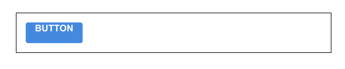
Button 컴포넌트 만들기
Button.js
import React from 'react';
import './Button.scss';

function Button({ children }) {
  return <button className="Button">{children}</button>;
}

export default Button;
Button.scss
$blue: #228be6; // 주석 선언

.Button {
  display: inline-flex;
  color: white;
  font-weight: bold;
  outline: none;
  border-radius: 4px;
  border: none;
  cursor: pointer;

  height: 2.25rem;
  padding-left: 1rem;
  padding-right: 1rem;
  font-size: 1rem;

  background: $blue; // 주석 사용
  &:hover {
    background: lighten($blue, 10%); // 색상 10% 밝게
  }

  &:active {
    background: darken($blue, 10%); // 색상 10% 어둡게
  }
}
App.js
import React from 'react';
import './App.scss';
import Button from './components/Button';
function App() {
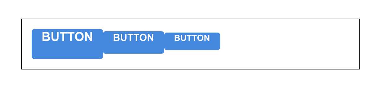
return (
<div className="App">
<div className="buttons">
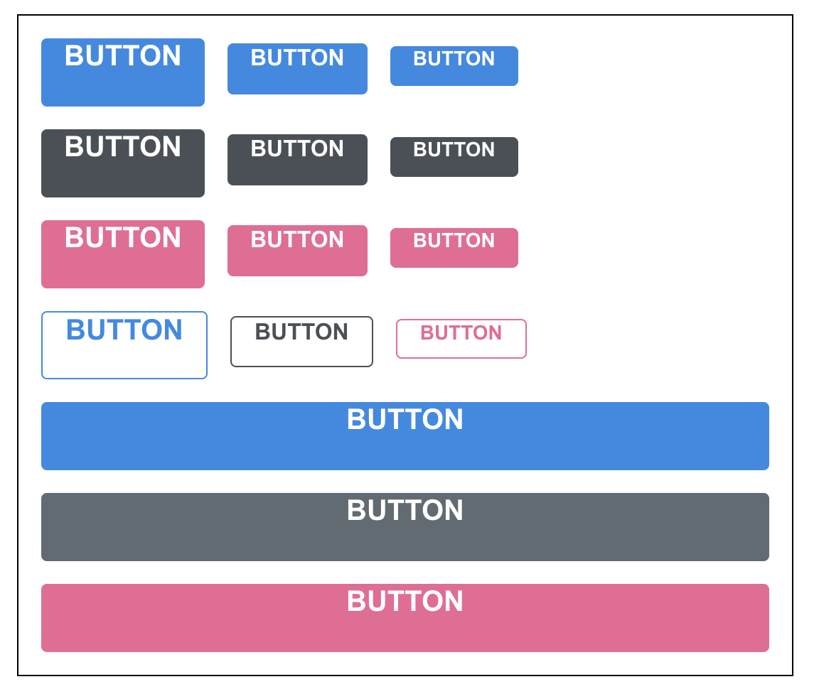
<Button>BUTTON</Button>
</div>
</div>
);
}
export default App;
App.scss
.App {
  width: 512px;
  margin: 0 auto;
  margin-top: 4rem;
  border: 1px solid black;
  padding: 1rem;
}

- 기존 css 에서는 사용하지 못하던 문법들을 사용했다.
- $blue: #228be6; 이런 식으로 스타일 파일에서 사용 할 수 있는 변수를 선언 할 수 있다.
- lighten() 또는 darken()와 같이 색상을 더 밝게하거나 어둡게 해주는 함수도 사용 할 수 있다.
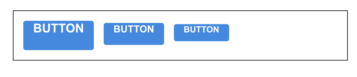
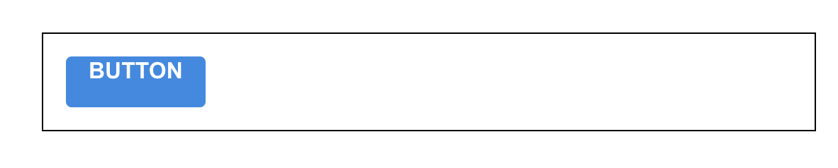
버튼 사이즈 조정
- className 에 CSS 클래스 이름을 동적으로 넣어주고 싶으면 이렇게 설정할 수 있다.
className={['Button', size].join(' ')}className={`Button ${size}`}
- 조건부로 CSS 클래스를 넣어주고 싶을때는 classnames 라는 라이브러리를 사용하는 것이 훨씬 편하다.
- classNames 를 사용하면 조건부 스타일링을 할 때 함수의 인자에 문자열, 배열, 객체 등을 전달하여 문자열을 조합 할 수 있다.
classNames('foo', 'bar'); // => 'foo bar'
classNames('foo', { bar: true }); // => 'foo bar'
classNames({ 'foo-bar': true }); // => 'foo-bar'
classNames({ 'foo-bar': false }); // => ''
classNames({ foo: true }, { bar: true }); // => 'foo bar'
classNames({ foo: true, bar: true }); // => 'foo bar'
classNames(['foo', 'bar']); // => 'foo bar'

// 동시에 여러개의 타입으로 받아올 수 도 있습니다.
classNames('foo', { bar: true, duck: false }, 'baz', { quux: true }); // => 'foo bar baz quux'

// false, null, 0, undefined 는 무시됩니다.
classNames(null, false, 'bar', undefined, 0, 1, { baz: null }, ''); // => 'bar 1'
Button.js
import React from 'react';
import classNames from 'classnames';
import './Button.scss';

function Button({ children, size }) {
  return <button className={classNames('Button', size)}>{children}</button>;
}

Button.defaultProps = {
  size: 'medium'
};

export default Button;
Button.scss
$blue: #228be6;

.Button {
  display: inline-flex;
  color: white;
  font-weight: bold;
  outline: none;
  border-radius: 4px;
  border: none;
  cursor: pointer;

  // 사이즈 관리
  &.large {
    height: 3rem;
    padding-left: 1rem;
    padding-right: 1rem;
    font-size: 1.25rem;
  }

  &.medium {
    height: 2.25rem;
    padding-left: 1rem;
    padding-right: 1rem;
    font-size: 1rem;
  }

  &.small {
    height: 1.75rem;
    font-size: 0.875rem;
    padding-left: 1rem;
    padding-right: 1rem;
  }

  background: $blue;
  &:hover {
    background: lighten($blue, 10%);
  }

  &:active {
    background: darken($blue, 10%);
  }
}
App.js
import React from 'react';
import './App.scss';
import Button from './components/Button';

function App() {
  return (
    <div className="App">
      <div className="buttons">
        <Button size="large">BUTTON</Button>
        <Button>BUTTON</Button>
        <Button size="small">BUTTON</Button>
      </div>
    </div>
  );
}

export default App;
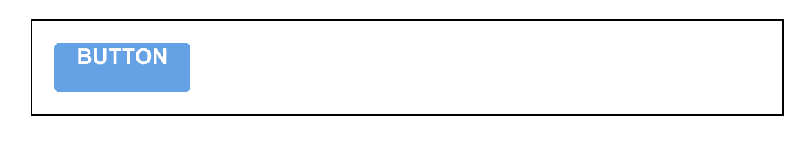
Button 사이 여백 설정 수정 Button.scss
$blue: #228be6;

.Button {
  display: inline-flex;
  color: white;
  font-weight: bold;
  outline: none;
  border-radius: 4px;
  border: none;
  cursor: pointer;

  // 사이즈 관리
  &.large {
    height: 3rem;
    padding-left: 1rem;
    padding-right: 1rem;
    font-size: 1.25rem;
  }

  &.medium {
    height: 2.25rem;
    padding-left: 1rem;
    padding-right: 1rem;
    font-size: 1rem;
  }

  &.small {
    height: 1.75rem;
    font-size: 0.875rem;
    padding-left: 1rem;
    padding-right: 1rem;
  }

  background: $blue;
  &:hover {
    background: lighten($blue, 10%);
  }

  &:active {
    background: darken($blue, 10%);
  }

  & + & {
    margin-left: 1rem;
  }
}
버튼 색상 설정하기
Button.js
import React from 'react';
import classNames from 'classnames';
import './Button.scss';

function Button({ children, size, color }) {
  return (
    <button className={classNames('Button', size, color)}>{children}</button>
  );
}

Button.defaultProps = {
  size: 'medium',
  color: 'blue'
};

export default Button;
Button.scss
$blue: #228be6;
$gray: #495057;
$pink: #f06595;

@mixin button-color($color) {
  background: $color;
  &:hover {
    background: lighten($color, 10%);
  }
  &:active {
    background: darken($color, 10%);
  }
}

.Button {
  display: inline-flex;
  color: white;
  font-weight: bold;
  outline: none;
  border-radius: 4px;
  border: none;
  cursor: pointer;

  // 사이즈 관리
  &.large {
    height: 3rem;
    padding-left: 1rem;
    padding-right: 1rem;
    font-size: 1.25rem;
  }

  &.medium {
    height: 2.25rem;
    padding-left: 1rem;
    padding-right: 1rem;
    font-size: 1rem;
  }

  &.small {
    height: 1.75rem;
    font-size: 0.875rem;
    padding-left: 1rem;
    padding-right: 1rem;
  }

  // 색상 관리
  &.blue {
    @include button-color($blue);
  }

  &.gray {
    @include button-color($gray);
  }

  &.pink {
    @include button-color($pink);
  }

  & + & {
    margin-left: 1rem;
  }
}
App.js
import React from 'react';
import './App.scss';
import Button from './components/Button';

function App() {
  return (
    <div className="App">
      <div className="buttons">
        <Button size="large">BUTTON</Button>
        <Button>BUTTON</Button>
        <Button size="small">BUTTON</Button>
      </div>
      <div className="buttons">
        <Button size="large" color="gray">
          BUTTON
        </Button>
        <Button color="gray">BUTTON</Button>
        <Button size="small" color="gray">
          BUTTON
        </Button>
      </div>
      <div className="buttons">
        <Button size="large" color="pink">
          BUTTON
        </Button>
        <Button color="pink">BUTTON</Button>
        <Button size="small" color="pink">
          BUTTON
        </Button>
      </div>
    </div>
  );
}

export default App;
App.scss
.App {
  width: 512px;
  margin: 0 auto;
  margin-top: 4rem;
  border: 1px solid black;
  padding: 1rem;
  .buttons + .buttons {
    margin-top: 1rem;
  }
}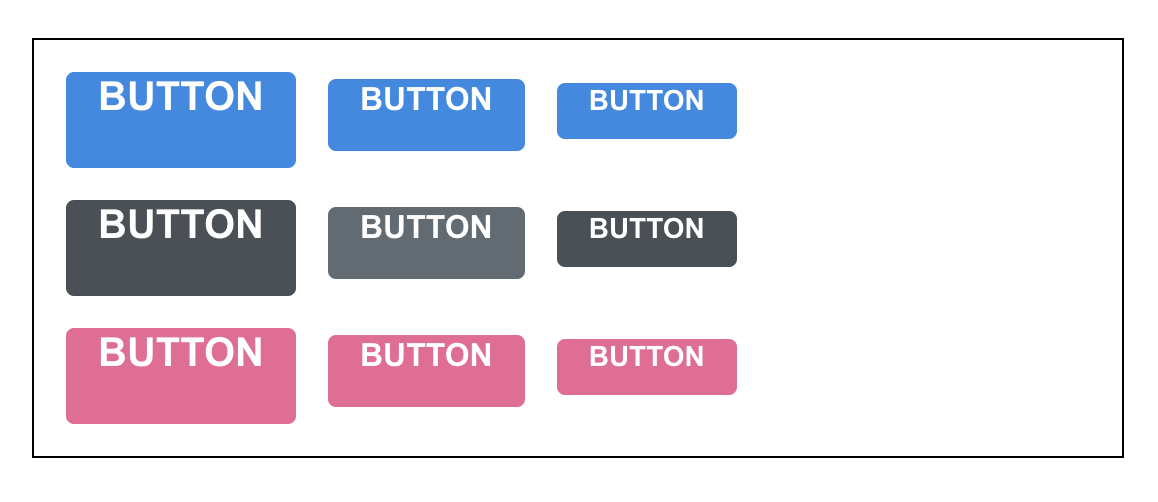
- 코드의 상단에서 색상 변수를 선언했고, 하단에서 CSS 클래스에 따라 다른 색상이 적용되도록 코드를 작성했다.
- 반복이 되는 코드는 Sass 의 mixin 이라는 기능을 사용하여 쉽게 재사용 할 수 있다.
outline 옵션 만들기
Button.js
import React from 'react';
import classNames from 'classnames';
import './Button.scss';

function Button({ children, size, color, outline }) {
  return (
    <button className={classNames('Button', size, color, { outline })}>
      {children}
    </button>
  );
}

Button.defaultProps = {
  size: 'medium',
  color: 'blue'
};

export default Button;
Button.scss
$blue: #228be6;
$gray: #495057;
$pink: #f06595;

@mixin button-color($color) {
  background: $color;
  &:hover {
    background: lighten($color, 10%);
  }
  &:active {
    background: darken($color, 10%);
  }
  &.outline {
    color: $color;
    background: none;
    border: 1px solid $color;
    &:hover {
      background: $color;
      color: white;
    }
  }
}

.Button {
  display: inline-flex;
  color: white;
  font-weight: bold;
  outline: none;
  border-radius: 4px;
  border: none;
  cursor: pointer;

  // 사이즈 관리
  &.large {
    height: 3rem;
    padding-left: 1rem;
    padding-right: 1rem;
    font-size: 1.25rem;
  }

  &.medium {
    height: 2.25rem;
    padding-left: 1rem;
    padding-right: 1rem;
    font-size: 1rem;
  }

  &.small {
    height: 1.75rem;
    font-size: 0.875rem;
    padding-left: 1rem;
    padding-right: 1rem;
  }

  // 색상 관리
  &.blue {
    @include button-color($blue);
  }

  &.gray {
    @include button-color($gray);
  }

  &.pink {
    @include button-color($pink);
  }

  & + & {
    margin-left: 1rem;
  }
}
전체 너비 차지 옵션
Button.js
import React from 'react';
import classNames from 'classnames';
import './Button.scss';

function Button({ children, size, color, outline, fullWidth }) {
  return (
    <button
      className={classNames('Button', size, color, { outline, fullWidth })}
    >
      {children}
    </button>
  );
}

Button.defaultProps = {
  size: 'medium',
  color: 'blue'
};

export default Button;
Button.scss
$blue: #228be6;
$gray: #495057;
$pink: #f06595;

@mixin button-color($color) {
  background: $color;
  &:hover {
    background: lighten($color, 10%);
  }
  &:active {
    background: darken($color, 10%);
  }
  &.outline {
    color: $color;
    background: none;
    border: 1px solid $color;
    &:hover {
      background: $color;
      color: white;
    }
  }
}

.Button {
  display: inline-flex;
  color: white;
  font-weight: bold;
  outline: none;
  border-radius: 4px;
  border: none;
  cursor: pointer;

  // 사이즈 관리
  &.large {
    height: 3rem;
    padding-left: 1rem;
    padding-right: 1rem;
    font-size: 1.25rem;
  }

  &.medium {
    height: 2.25rem;
    padding-left: 1rem;
    padding-right: 1rem;
    font-size: 1rem;
  }

  &.small {
    height: 1.75rem;
    font-size: 0.875rem;
    padding-left: 1rem;
    padding-right: 1rem;
  }

  // 색상 관리
  &.blue {
    @include button-color($blue);
  }

  &.gray {
    @include button-color($gray);
  }

  &.pink {
    @include button-color($pink);
  }

  & + & {
    margin-left: 1rem;
  }

  &.fullWidth {
    width: 100%;
    justify-content: center;
    & + & {
      margin-left: 0;
      margin-top: 1rem;
    }
  }
}
- fullWidth 라는 옵션을 버튼이 전체 너비를 차지하도록 구현했다.
rest props 전달하기
Button.js
import React from 'react';
import classNames from 'classnames';
import './Button.scss';

function Button({ children, size, color, outline, fullWidth, ...rest }) {
  return (
    <button
      className={classNames('Button', size, color, { outline, fullWidth })}
      {...rest}
    >
      {children}
    </button>
  );
}

Button.defaultProps = {
  size: 'medium',
  color: 'blue'
};

export default Button;
App.js
import React from 'react';
import './App.scss';
import Button from './components/Button';

function App() {
  return (
    <div className="App">
      <div className="buttons">
        <Button size="large" onClick={() => console.log('클릭됐다!')}>
          BUTTON
        </Button>
        <Button>BUTTON</Button>
        <Button size="small">BUTTON</Button>
      </div>
      <div className="buttons">
        <Button size="large" color="gray">
          BUTTON
        </Button>
        <Button color="gray">BUTTON</Button>
        <Button size="small" color="gray">
          BUTTON
        </Button>
      </div>
      <div className="buttons">
        <Button size="large" color="pink">
          BUTTON
        </Button>
        <Button color="pink">BUTTON</Button>
        <Button size="small" color="pink">
          BUTTON
        </Button>
      </div>
      <div className="buttons">
        <Button size="large" color="blue" outline>
          BUTTON
        </Button>
        <Button color="gray" outline>
          BUTTON
        </Button>
        <Button size="small" color="pink" outline>
          BUTTON
        </Button>
      </div>
      <div className="buttons">
        <Button size="large" fullWidth>
          BUTTON
        </Button>
        <Button size="large" color="gray" fullWidth>
          BUTTON
        </Button>
        <Button size="large" color="pink" fullWidth>
          BUTTON
        </Button>
      </div>
    </div>
  );
}

export default App;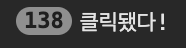
- spread 와 rest 문법은 주로 배열과 객체, 함수의 파라미터, 인자를 다룰 때 사용하는데, 컴포넌트에서도 사용 할 수 있다.
- rest를 사용해서 지정한 props 를 제외한 값들을 rest 라는 객체에 모아주고, <button> 태그에 {...rest} 를 해주면, rest 안에 있는 객체안에 있는 값들을 모두 <button> 태그에 설정할 수 있다
02. CSS Module
리액트 프로젝트에서 컴포넌트를 스타일링 할 때 CSS Module을 사용하면, CSS 클래스가 중첩되는 것을 방지할 수 있다.
CRA 로 만든 프로젝트에서 CSS Module 를 사용 할 때에는, CSS 파일의 확장자를 .module.css 로 하면 된다.
Box.module.css
.Box {
  background: black;
  color: white;
  padding: 2rem;
}
- 리액트 컴포넌트 파일에서 해당 CSS 파일을 불러올 때 CSS 파일에 선언한 클래스 이름들이 모두 고유해진다.
- 고유 CSS 클래스 이름이 만들어지는 과정에서는 파일 경로, 파일 이름, 클래스 이름, 해쉬값 등이 사용 될 수 있다.
Box.js
import React from "react";
import styles from "./Box.module.css";

function Box() {
  return <div className={styles.Box}>{styles.Box}</div>;
}

export default Box;
- className 을 설정 할 때에는 styles.Box과 같이 import로 불러온 styles 객체 안에 있는 값을 참조해야 한다.
클래스 이름에 대하여 고유한 이름들이 만들어지기 때문에, 실수로 CSS 클래스 이름이 다른 관계 없는 곳에서 사용한 CSS 클래스 이름과 중복되는 일에 대하여 걱정 할 필요가 없다. 이 기술은 다음과 같은 상황에 사용하면 유용하다.
- 레거시 프로젝트에 리액트를 도입할 때 (기존 프로젝트에 있던 CSS 클래스와 이름이 중복되어도 스타일이 꼬이지 않게 해준다.)
- CSS 클래스를 중복되지 않게 작성하기 위하여 CSS 클래스 네이밍 규칙을 만들기 귀찮을 때
리액트 컴포넌트를 위한 클래스를 작성 할 때 제가 자주 사용하는 CSS 클래스 네이밍 규칙은 다음과 같다.
- 컴포넌트의 이름은 다른 컴포넌트랑 중복되지 않게 한다.
- 컴포넌트의 최상단 CSS 클래스는 컴포넌트의 이름과 일치시킨다. (예: .Button)
- 컴포넌트 내부에서 보여지는 CSS 클래스는 CSS Selector 를 잘 활용한다. (예: .MyForm .my-input)
만약 CSS 클래스 네이밍 규칙을 만들고 따르기 싫다면, CSS Module 을 사용하면 된다.
CheckBox.js
import React from 'react';
function CheckBox({ children, checked, ...rest }) {
return (
<div>
<label>
<input type="checkbox" checked={checked} {...rest} />
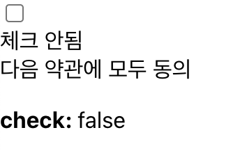
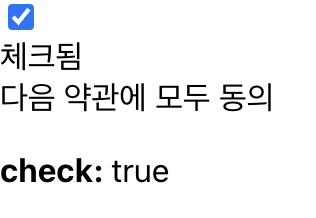
<div>{checked ? '체크됨' : '체크 안됨'}</div>
</label>
<span>{children}</span>
</div>
);
}
export default CheckBox;
App.js
import React, { useState } from 'react';
import CheckBox from './components/CheckBox';
function App() {
const [check, setCheck] = useState(false);
const onChange = e => {
setCheck(e.target.checked);
};
return (
<div>
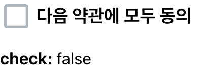
<CheckBox onChange={onChange} checked={check}>
다음 약관에 모두 동의
</CheckBox>
<p>
<b>check: </b>
{check ? 'true' : 'false'}
</p>
</div>
);
}
export default App;
- ...rest를 사용한 이유는, CheckBox 컴포넌트에게 전달하게 될 name, onChange 같은 값을 그대로 input 에게 넣어주기 위함이다.
- 지금 input이 아닌 텍스트 부분을 선택했는데도 값이 바뀌는 이유는 현재 우리가 해당 내용을 label 태그로 감싸줬기 때문이다.
react-icons 라이브러리를 설치
$ yarn add react-icons
- 라이브러리를 사용하면 Font Awesome, Ionicons, Material Design Icons 등의 아이콘을 컴포넌트 형태로 쉽게 사용 할 수 있다.
- 해당 라이브러리의 문서 를 열어 원하는 아이콘들을 불러와서 사용하면 된다.
- 여기서는 Material Design Icons 의 MdCheckBox, MdCheckBoxOutline 을 사용하겠다.
CheckBox.js
import React from 'react';
import { MdCheckBox, MdCheckBoxOutlineBlank } from 'react-icons/md';
import styles from './CheckBox.module.css';

function CheckBox({ children, checked, ...rest }) {
  return (
    <div className={styles.checkbox}>
      <label>
        <input type="checkbox" checked={checked} {...rest} />
        <div className={styles.icon}>
          {checked ? (
            <MdCheckBox className={styles.checked} />
          ) : (
            <MdCheckBoxOutlineBlank />
          )}
        </div>
      </label>
      <span>{children}</span>
    </div>
  );
}

export default CheckBox;
CheckBox.module.css
.checkbox {
  display: flex;
  align-items: center;
}

.checkbox label {
  cursor: pointer;
}

/* 실제 input 을 숨기기 위한 코드 */
.checkbox input {
  width: 0;
  height: 0;
  position: absolute;
  opacity: 0;
}

.checkbox span {
  font-size: 1.125rem;
  font-weight: bold;
}

.icon {
  display: flex;
  align-items: center;
  /* 아이콘의 크기는 폰트 사이즈로 조정 가능 */
  font-size: 2rem;
  margin-right: 0.25rem;
  color: #adb5bd;
}

.checked {
  color: #339af0;
}
- CSS Module 을 작성 할 때에는 CSS 클래스 이름이 다른 곳에서 사용되는 CSS 클래스 이름과 중복될 일이 없기 때문에 .icon, .checkbox 같은 짧고 흔한 이름을 사용해도 상관이 없다.
- CSS Module 을 사용 할 때에는 styles.icon 이런 식으로 객체안에 있는 값을 조회해야 하는데, 만약 클래스 이름에 - 가 들어가 있다면 다음과 같이 사용해야한다: styles['my-class']
- 만약 여러 개가 있다면 다음과 같이 작성해야한다: ${styles.one} ${styles.two}
- 조건부 스타일링을 해야 한다면 ${styles.one} ${condition ? styles.two : ''}
- Sass 를 배울 때 썼었던 classnames 라이브러리의 bind 기능을 사용하면 CSS Module을 더 편하게 사용 할 수 있다.

CheckBox.js
import React from 'react';
import { MdCheckBox, MdCheckBoxOutlineBlank } from 'react-icons/md';
import styles from './CheckBox.module.css';
import classNames from 'classnames/bind';

const cx = classNames.bind(styles);

function CheckBox({ children, checked, ...rest }) {
  return (
    <div className={cx('checkbox')}>
      <label>
        <input type="checkbox" checked={checked} {...rest} />
        <div className={cx('icon')}>
          {checked ? (
            <MdCheckBox className={cx('checked')} />
          ) : (
            <MdCheckBoxOutlineBlank />
          )}
        </div>
      </label>
      <span>{children}</span>
    </div>
  );
}

export default CheckBox;
- classnames 의 bind 기능을 사용하면, CSS 클래시 이름을 지정해 줄 때 cx('클래스이름') 과 같은 형식으로 편하게 사용 할 수 있다.
- 여러개의 CSS 클래스를 사용해야하거나, 조건부 스타일링을 해야할 때 더욱 편리하다.
cx('one', 'two')
cx('my-component', {
  condition: true
})
cx('my-component', ['another', 'classnames'])
03. styled-components
- CSS in JS는 JS 안에 CSS 를 작성하는 것을 의미한다.
- styled-components 는 현존하는 CSS in JS 관련 리액트 라이브러리 중에서 가장 인기 있는 라이브러리이다.
- 이에 대한 대안으로는 emotion 와 styled-jsx가 있다.
Tagged Template Literal
- styled-components 를 사용하기 전에, Tagged Template Literal 이라는 문법에 대하여 짚고 넘어가면, styled-components 가 내부적으로 어떻게 작동하는지 이해 할 수 있다.
- Template Literal은 문자열 조합을 더욱 쉽게 할 수 있게 해주는 ES6 문법이다.
styled-components 사용하기
$ npx create-react-app styling-with-styled-components
$ cd styling-with-styled-components
$ yarn add styled-components- 새로운 리액트 프로젝트 생성
- styled-components 를 설치
App.js
import React from 'react';
import styled from 'styled-components';

const Circle = styled.div`
  width: 5rem;
  height: 5rem;
  background: black;
  border-radius: 50%;
`;

function App() {
  return <Circle />;
}

export default App;
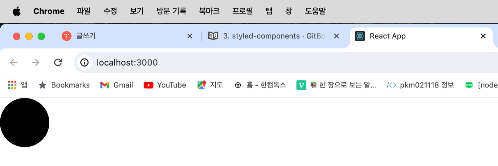
- styled-components 를 사용하면 이렇게 스타일을 입력함과 동시에 해당 스타일을 가진 컴포넌트를 만들 수 있다.
- 만약에 div 를 스타일링 하고 싶으면 styled.div, input 을 스타일링 하고 싶으면 styled.input 이런식으로 사용할 수 있다.
App.js
import React from 'react';
import styled from 'styled-components';

const Circle = styled.div`
  width: 5rem;
  height: 5rem;
  background: ${props => props.color || 'black'};
  border-radius: 50%;
`;

function App() {
  return <Circle color="blue" />;
}

export default App;
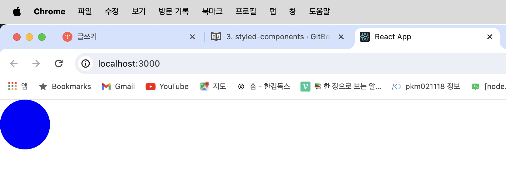
- Circle 컴포넌트에서 color props 값을 설정해줬으면 해당 값을 배경색으로 설정하고, 그렇지 않으면 검정색을 배경색으로 사용하도록 설정되었습니다.
App.js
import React from 'react';
import styled, { css } from 'styled-components';

const Circle = styled.div`
  width: 5rem;
  height: 5rem;
  background: ${props => props.color || 'black'};
  border-radius: 50%;
  ${props =>
    props.huge &&
    css`
      width: 10rem;
      height: 10rem;
    `}
`;

function App() {
  return <Circle color="red" huge />;
}

export default App;
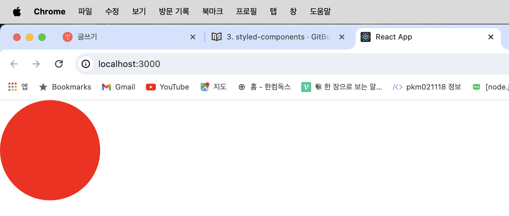
- 여러 줄의 CSS 코드를 조건부로 보여주고 싶다면 css 를 사용해야한다.
- css 를 불러와서 사용을 해야 그 스타일 내부에서도 다른 props 를 조회 할 수 있다.
Button 만들기
components/Button.js
import React from 'react';
import styled from 'styled-components';

const StyledButton = styled.button`
  /* 공통 스타일 */
  display: inline-flex;
  outline: none;
  border: none;
  border-radius: 4px;
  color: white;
  font-weight: bold;
  cursor: pointer;
  padding-left: 1rem;
  padding-right: 1rem;

  /* 크기 */
  height: 2.25rem;
  font-size: 1rem;

  /* 색상 */
  background: #228be6;
  &:hover {
    background: #339af0;
  }
  &:active {
    background: #1c7ed6;
  }

  /* 기타 */
  & + & {
    margin-left: 1rem;
  }
`;

function Button({ children, ...rest }) {
  return <StyledButton {...rest}>{children}</StyledButton>;
}

export default Button;
App.js
import React from 'react';
import styled from 'styled-components';
import Button from './components/Button';

const AppBlock = styled.div`
  width: 512px;
  margin: 0 auto;
  margin-top: 4rem;
  border: 1px solid black;
  padding: 1rem;
`;

function App() {
  return (
    <AppBlock>
      <Button>BUTTON</Button>
    </AppBlock>
  );
}

export default App;
- Sass 를 배울 때 만들었던 재사용성 높은 Button 컴포넌트를 styled-components 로 구현
polished의 스타일 관련 유틸 함수 사용하기
라이브러리 설치
$ yarn add polished
Button.js
import React from 'react';
import styled from 'styled-components';
import { darken, lighten } from 'polished';

const StyledButton = styled.button`
  /* 공통 스타일 */
  display: inline-flex;
  outline: none;
  border: none;
  border-radius: 4px;
  color: white;
  font-weight: bold;
  cursor: pointer;
  padding-left: 1rem;
  padding-right: 1rem;

  /* 크기 */
  height: 2.25rem;
  font-size: 1rem;

  /* 색상 */
  background: #228be6;
  &:hover {
    background: ${lighten(0.1, '#228be6')};
  }
  &:active {
    background: ${darken(0.1, '#228be6')};
  }

  /* 기타 */
  & + & {
    margin-left: 1rem;
  }
`;

function Button({ children, ...rest }) {
  return <StyledButton {...rest}>{children}</StyledButton>;
}

export default Button;
App.js
import React from 'react';
import styled, { ThemeProvider } from 'styled-components';
import Button from './components/Button';

const AppBlock = styled.div`
  width: 512px;
  margin: 0 auto;
  margin-top: 4rem;
  border: 1px solid black;
  padding: 1rem;
`;

function App() {
  return (
    <ThemeProvider
      theme={{
        palette: {
          blue: '#228be6',
          gray: '#495057',
          pink: '#f06595'
        }
      }}
    >
      <AppBlock>
        <Button>BUTTON</Button>
        <Button color="gray">BUTTON</Button>
        <Button color="pink">BUTTON</Button>
      </AppBlock>
    </ThemeProvider>
  );
}

export default App;
Button.js
import React from 'react';
import styled, { css } from 'styled-components';
import { darken, lighten } from 'polished';

const StyledButton = styled.button`
  /* 공통 스타일 */
  display: inline-flex;
  outline: none;
  border: none;
  border-radius: 4px;
  color: white;
  font-weight: bold;
  cursor: pointer;
  padding-left: 1rem;
  padding-right: 1rem;

  /* 크기 */
  height: 2.25rem;
  font-size: 1rem;

  /* 색상 */
  ${props => {
    const selected = props.theme.palette[props.color];
    return css`
      background: ${selected};
      &:hover {
        background: ${lighten(0.1, selected)};
      }
      &:active {
        background: ${darken(0.1, selected)};
      }
    `;
  }}

  /* 기타 */
  & + & {
    margin-left: 1rem;
  }
`;

function Button({ children, ...rest }) {
  return <StyledButton {...rest}>{children}</StyledButton>;
}

Button.defaultProps = {
  color: 'blue'
};

export default Button;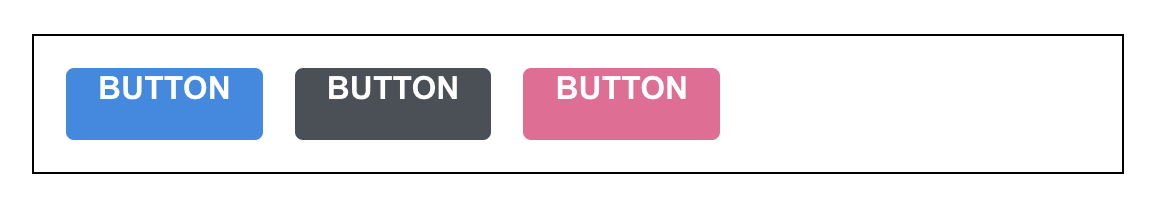
- 색상 코드를 지닌 변수를 Button.js 에서 선언을 하는 대신에 ThemeProvider 기능을 사용하여 styled-components 로 만드는 모든 컴포넌트에서 조회하여 사용 할 수 있는 전역적인 값을 설정하였다.
- 이렇게 theme를 설정하면 ThemeProvider 내부에 렌더링된 styled-components 로 만든 컴포넌트에서 palette 를 조회하여 사용 할 수 있다.
- ThemeProvider 로 설정한 값은 styled-components 에서 props.theme 로 조회 할 수 있다.
- Button 컴포넌트의 코드는 아래와 같이 리팩토링 할 수 있습니다.
components/Button.js
import React from 'react';
import styled, { css } from 'styled-components';
import { darken, lighten } from 'polished';

const StyledButton = styled.button`
  /* 공통 스타일 */
  display: inline-flex;
  outline: none;
  border: none;
  border-radius: 4px;
  color: white;
  font-weight: bold;
  cursor: pointer;
  padding-left: 1rem;
  padding-right: 1rem;

  /* 크기 */
  height: 2.25rem;
  font-size: 1rem;

  /* 색상 */
  ${({ theme, color }) => {
    const selected = theme.palette[color];
    return css`
      background: ${selected};
      &:hover {
        background: ${lighten(0.1, selected)};
      }
      &:active {
        background: ${darken(0.1, selected)};
      }
    `;
  }}

  /* 기타 */
  & + & {
    margin-left: 1rem;
  }
`;

function Button({ children, color, ...rest }) {
  return <StyledButton color={color} {...rest}>{children}</StyledButton>;
}

Button.defaultProps = {
  color: 'blue'
};

export default Button;
- props.theme.palette.blue 이런식으로 값을 조회하는 대신 비구조화 할당 문법을 사용하여 가독성을 높여주었다.
components/Button.js
import React from 'react';
import styled, { css } from 'styled-components';
import { darken, lighten } from 'polished';

const colorStyles = css`
  ${({ theme, color }) => {
    const selected = theme.palette[color];
    return css`
      background: ${selected};
      &:hover {
        background: ${lighten(0.1, selected)};
      }
      &:active {
        background: ${darken(0.1, selected)};
      }
    `;
  }}
`;

const sizeStyles = css`
  ${props =>
    props.size === 'large' &&
    css`
      height: 3rem;
      font-size: 1.25rem;
    `}

  ${props =>
    props.size === 'medium' &&
    css`
      height: 2.25rem;
      font-size: 1rem;
    `}

    ${props =>
      props.size === 'small' &&
      css`
        height: 1.75rem;
        font-size: 0.875rem;
      `}
`;

const StyledButton = styled.button`
  /* 공통 스타일 */
  display: inline-flex;
  outline: none;
  border: none;
  border-radius: 4px;
  color: white;
  font-weight: bold;
  cursor: pointer;
  padding-left: 1rem;
  padding-right: 1rem;

  /* 크기 */
  ${sizeStyles}

  /* 색상 */
  ${colorStyles}

  /* 기타 */
  & + & {
    margin-left: 1rem;
  }
`;

function Button({ children, color, size,  ...rest }) {
  return (
    <StyledButton color={color} size={size} {...rest}>
      {children}
    </StyledButton>
  );
}

Button.defaultProps = {
  color: 'blue'
};

export default Button;
App.js
import React from 'react';
import styled, { ThemeProvider } from 'styled-components';
import Button from './components/Button';

const AppBlock = styled.div`
  width: 512px;
  margin: 0 auto;
  margin-top: 4rem;
  border: 1px solid black;
  padding: 1rem;
`;

const ButtonGroup = styled.div`
  & + & {
    margin-top: 1rem;
  }
`;

function App() {
  return (
    <ThemeProvider
      theme={{
        palette: {
          blue: '#228be6',
          gray: '#495057',
          pink: '#f06595'
        }
      }}
    >
      <AppBlock>
        <ButtonGroup>
          <Button size="large">BUTTON</Button>
          <Button>BUTTON</Button>
          <Button size="small">BUTTON</Button>
        </ButtonGroup>
        <ButtonGroup>
          <Button color="gray" size="large">
            BUTTON
          </Button>
          <Button color="gray">BUTTON</Button>
          <Button color="gray" size="small">
            BUTTON
          </Button>
        </ButtonGroup>
        <ButtonGroup>
          <Button color="pink" size="large">
            BUTTON
          </Button>
          <Button color="pink">BUTTON</Button>
          <Button color="pink" size="small">
            BUTTON
          </Button>
        </ButtonGroup>
      </AppBlock>
    </ThemeProvider>
  );
}

export default App;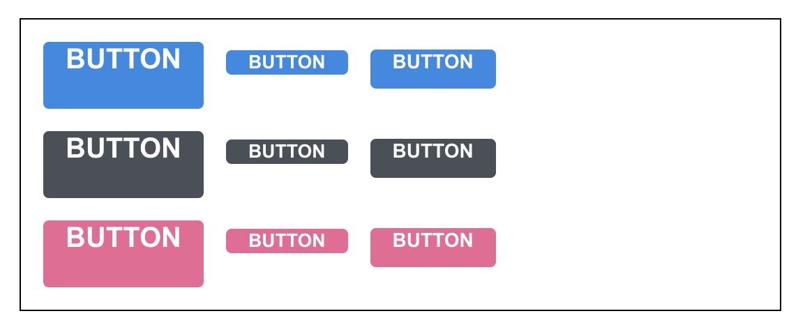
- size props 를 설정하여 버튼의 크기도 다양하게 만들었다.
- sizeStyles 에 해당하는 코드를 따로 분리하지 않고 StyledButton 의 스타일 내부에 바로 적어도 상관 없다.
components/Button.js
import React from 'react';
import styled, { css } from 'styled-components';
import { darken, lighten } from 'polished';

const colorStyles = css`
  ${({ theme, color }) => {
    const selected = theme.palette[color];
    return css`
      background: ${selected};
      &:hover {
        background: ${lighten(0.1, selected)};
      }
      &:active {
        background: ${darken(0.1, selected)};
      }
      ${props =>
        props.outline &&
        css`
          color: ${selected};
          background: none;
          border: 1px solid ${selected};
          &:hover {
            background: ${selected};
            color: white;
          }
        `}
    `;
  }}
`;

const sizes = {
  large: {
    height: '3rem',
    fontSize: '1.25rem'
  },
  medium: {
    height: '2.25rem',
    fontSize: '1rem'
  },
  small: {
    height: '1.75rem',
    fontSize: '0.875rem'
  }
};

const sizeStyles = css`
  ${({ size }) => css`
    height: ${sizes[size].height};
    font-size: ${sizes[size].fontSize};
  `}
`;

const fullWidthStyle = css`
  ${props =>
    props.fullWidth &&
    css`
      width: 100%;
      justify-content: center;
      & + & {
        margin-left: 0;
        margin-top: 1rem;
      }
    `}
`;

const StyledButton = styled.button`
  /* 공통 스타일 */
  display: inline-flex;
  outline: none;
  border: none;
  border-radius: 4px;
  color: white;
  font-weight: bold;
  cursor: pointer;
  padding-left: 1rem;
  padding-right: 1rem;

  /* 크기 */
  ${sizeStyles}

  /* 색상 */
  ${colorStyles}

  /* 기타 */
  & + & {
    margin-left: 1rem;
  }

  ${fullWidthStyle}
`;

function Button({ children, color, size, outline, fullWidth, ...rest }) {
  return (
    <StyledButton
      color={color}
      size={size}
      outline={outline}
      fullWidth={fullWidth}
      {...rest}
    >
      {children}
    </StyledButton>
  );
}

Button.defaultProps = {
  color: 'blue',
  size: 'medium'
};

export default Button;
App.js
import React from 'react';
import styled, { ThemeProvider } from 'styled-components';
import Button from './components/Button';

const AppBlock = styled.div`
  width: 512px;
  margin: 0 auto;
  margin-top: 4rem;
  border: 1px solid black;
  padding: 1rem;
`;

const ButtonGroup = styled.div`
  & + & {
    margin-top: 1rem;
  }
`;

function App() {
  return (
    <ThemeProvider
      theme={{
        palette: {
          blue: '#228be6',
          gray: '#495057',
          pink: '#f06595'
        }
      }}
    >
      <AppBlock>
        <ButtonGroup>
          <Button size="large">BUTTON</Button>
          <Button>BUTTON</Button>
          <Button size="small">BUTTON</Button>
        </ButtonGroup>
        <ButtonGroup>
          <Button color="gray" size="large">
            BUTTON
          </Button>
          <Button color="gray">BUTTON</Button>
          <Button color="gray" size="small">
            BUTTON
          </Button>
        </ButtonGroup>
        <ButtonGroup>
          <Button color="pink" size="large">
            BUTTON
          </Button>
          <Button color="pink">BUTTON</Button>
          <Button color="pink" size="small">
            BUTTON
          </Button>
        </ButtonGroup>
        <ButtonGroup>
          <Button size="large" outline>
            BUTTON
          </Button>
          <Button color="gray" outline>
            BUTTON
          </Button>
          <Button color="pink" size="small" outline>
            BUTTON
          </Button>
        </ButtonGroup>
        <ButtonGroup>
          <Button size="large" fullWidth>
            BUTTON
          </Button>
          <Button size="large" color="gray" fullWidth>
            BUTTON
          </Button>
          <Button size="large" color="pink" fullWidth>
            BUTTON
          </Button>
        </ButtonGroup>
      </AppBlock>
    </ThemeProvider>
  );
}

export default App;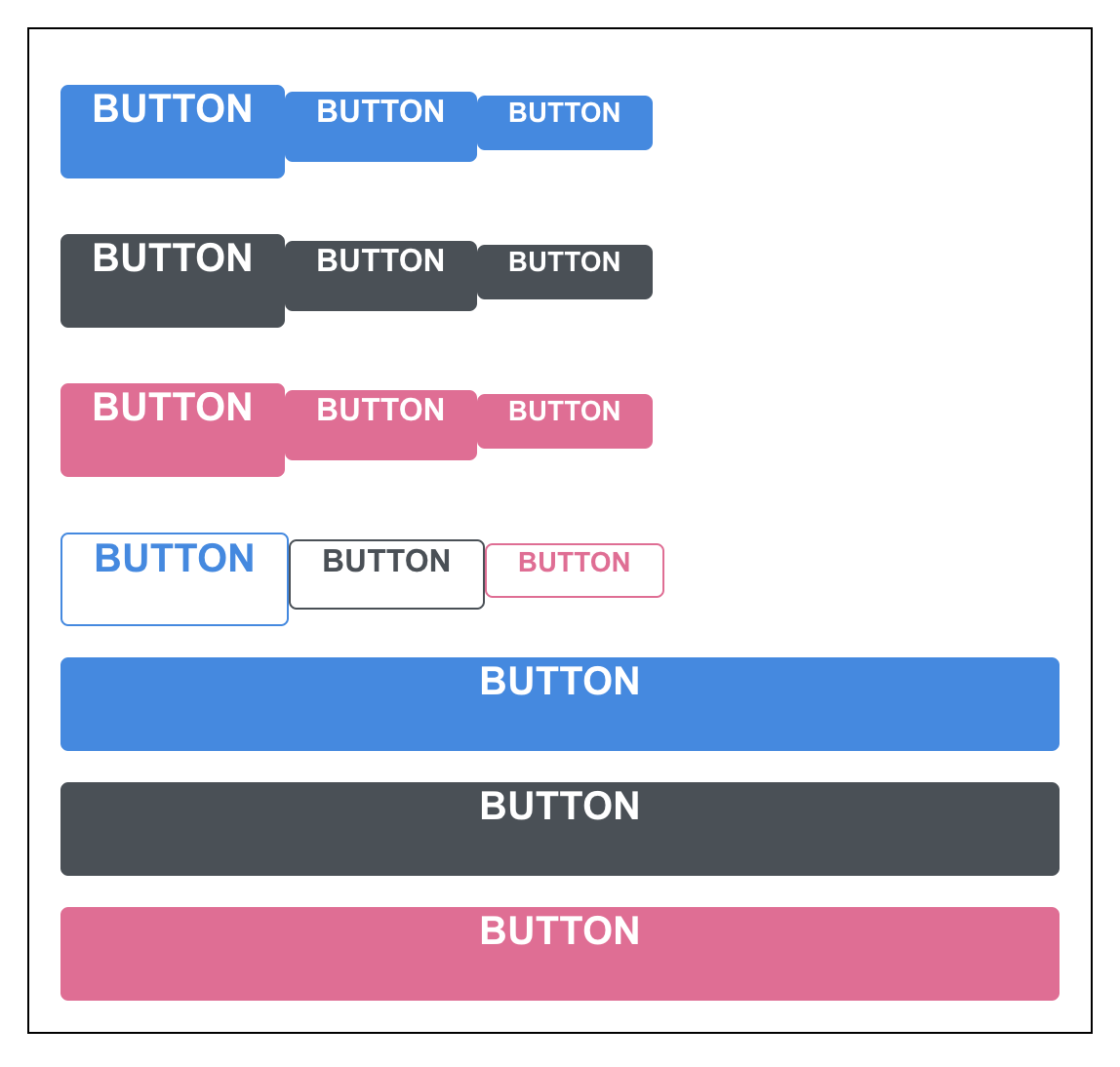
- Button 컴포넌트에 outline 이라는 props 를 설정하여 이 값이 true 일 때에는 테두리만 지닌 버튼을 보여주도록 설정했다.
- fullWidth 라는 props 가 주어졌다면 버튼의 크기가 100% 를 차지하도록 만들었다.
Dialog 만들기
App.js
import React, { useState } from 'react';
import styled, { ThemeProvider } from 'styled-components';
import Button from './components/Button';
import Dialog from './components/Dialog';

const AppBlock = styled.div`
  width: 512px;
  margin: 0 auto;
  margin-top: 4rem;
  border: 1px solid black;
  padding: 1rem;
`;

const ButtonGroup = styled.div`
  & + & {
    margin-top: 1rem;
  }
`;

function App() {
  const [dialog, setDialog] = useState(false);
  const onClick = () => {
    setDialog(true);
  };
  const onConfirm = () => {
    console.log('확인');
    setDialog(false);
  };
  const onCancel = () => {
    console.log('취소');
    setDialog(false);
  };

  return (
    <ThemeProvider
      theme={{
        palette: {
          blue: '#228be6',
          gray: '#495057',
          pink: '#f06595'
        }
      }}
    >
      <>
        <AppBlock>
          <ButtonGroup>
            <Button size="large">BUTTON</Button>
            <Button>BUTTON</Button>
            <Button size="small">BUTTON</Button>
          </ButtonGroup>
          <ButtonGroup>
            <Button color="gray" size="large">
              BUTTON
            </Button>
            <Button color="gray">BUTTON</Button>
            <Button color="gray" size="small">
              BUTTON
            </Button>
          </ButtonGroup>
          <ButtonGroup>
            <Button color="pink" size="large">
              BUTTON
            </Button>
            <Button color="pink">BUTTON</Button>
            <Button color="pink" size="small">
              BUTTON
            </Button>
          </ButtonGroup>
          <ButtonGroup>
            <Button size="large" outline>
              BUTTON
            </Button>
            <Button color="gray" outline>
              BUTTON
            </Button>
            <Button color="pink" size="small" outline>
              BUTTON
            </Button>
          </ButtonGroup>
          <ButtonGroup>
            <Button size="large" fullWidth>
              BUTTON
            </Button>
            <Button size="large" color="gray" fullWidth>
              BUTTON
            </Button>
            <Button size="large" color="pink" fullWidth onClick={onClick}>
              삭제
            </Button>
          </ButtonGroup>
        </AppBlock>
        <Dialog
          title="정말로 삭제하시겠습니까?"
          confirmText="삭제"
          cancelText="취소"
          onConfirm={onConfirm}
          onCancel={onCancel}
          visible={dialog}
        >
          데이터를 정말로 삭제하시겠습니까?
        </Dialog>
      </>
    </ThemeProvider>
  );
}

export default App;
Button.js
import React from 'react';
import styled, { css } from 'styled-components';
import { darken, lighten } from 'polished';

const colorStyles = css`
  ${({ theme, color }) => {
    const selected = theme.palette[color];
    return css`
      background: ${selected};
      &:hover {
        background: ${lighten(0.1, selected)};
      }
      &:active {
        background: ${darken(0.1, selected)};
      }
      ${props =>
        props.outline &&
        css`
          color: ${selected};
          background: none;
          border: 1px solid ${selected};
          &:hover {
            background: ${selected};
            color: white;
          }
        `}
    `;
  }}
`;

const sizes = {
  large: {
    height: '3rem',
    fontSize: '1.25rem'
  },
  medium: {
    height: '2.25rem',
    fontSize: '1rem'
  },
  small: {
    height: '1.75rem',
    fontSize: '0.875rem'
  }
};

const sizeStyles = css`
  ${({ size }) => css`
    height: ${sizes[size].height};
    font-size: ${sizes[size].fontSize};
  `}
`;

const fullWidthStyle = css`
  ${props =>
    props.fullWidth &&
    css`
      width: 100%;
      justify-content: center;
      & + & {
        margin-left: 0;
        margin-top: 1rem;
      }
    `}
`;

const StyledButton = styled.button`
  /* 공통 스타일 */
  display: inline-flex;
  align-items: center;
  justify-content: center;
  outline: none;
  border: none;
  border-radius: 4px;
  color: white;
  font-weight: bold;
  cursor: pointer;
  padding-left: 1rem;
  padding-right: 1rem;

  /* 크기 */
  ${sizeStyles}

  /* 색상 */
  ${colorStyles}

  /* 기타 */
  & + & {
    margin-left: 1rem;
  }

  ${fullWidthStyle}
`;

function Button({ children, color, size, outline, fullWidth, ...rest }) {
  return (
    <StyledButton
      color={color}
      size={size}
      outline={outline}
      fullWidth={fullWidth}
      {...rest}
    >
      {children}
    </StyledButton>
  );
}

Button.defaultProps = {
  color: 'blue',
  size: 'medium'
};

export default Button;
Dialog.js
import React, { useState, useEffect } from 'react';
import styled, { keyframes, css } from 'styled-components';
import Button from './Button';

const fadeIn = keyframes`
  from {
    opacity: 0
  }
  to {
    opacity: 1
  }
`;

const fadeOut = keyframes`
  from {
    opacity: 1
  }
  to {
    opacity: 0
  }
`;

const slideUp = keyframes`
  from {
    transform: translateY(200px);
  }
  to {
    transform: translateY(0px);
  }
`;

const slideDown = keyframes`
  from {
    transform: translateY(0px);
  }
  to {
    transform: translateY(200px);
  }
`;

const DarkBackground = styled.div`
  position: fixed;
  left: 0;
  top: 0;
  width: 100%;
  height: 100%;
  display: flex;
  align-items: center;
  justify-content: center;
  background: rgba(0, 0, 0, 0.8);

  animation-duration: 0.25s;
  animation-timing-function: ease-out;
  animation-name: ${fadeIn};
  animation-fill-mode: forwards;

  ${props =>
    props.disappear &&
    css`
      animation-name: ${fadeOut};
    `}
`;

const DialogBlock = styled.div`
  width: 320px;
  padding: 1.5rem;
  background: white;
  border-radius: 2px;
  h3 {
    margin: 0;
    font-size: 1.5rem;
  }
  p {
    font-size: 1.125rem;
  }

  animation-duration: 0.25s;
  animation-timing-function: ease-out;
  animation-name: ${slideUp};
  animation-fill-mode: forwards;

  ${props =>
    props.disappear &&
    css`
      animation-name: ${slideDown};
    `}
`;

const ButtonGroup = styled.div`
  margin-top: 3rem;
  display: flex;
  justify-content: flex-end;
`;

const ShortMarginButton = styled(Button)`
  & + & {
    margin-left: 0.5rem;
  }
`;

function Dialog({
  title,
  children,
  confirmText,
  cancelText,
  onConfirm,
  onCancel,
  visible
}) {
  const [animate, setAnimate] = useState(false);
  const [localVisible, setLocalVisible] = useState(visible);

  useEffect(() => {
    // visible 값이 true -> false 가 되는 것을 감지
    if (localVisible && !visible) {
      setAnimate(true);
      setTimeout(() => setAnimate(false), 250);
    }
    setLocalVisible(visible);
  }, [localVisible, visible]);

  if (!animate && !localVisible) return null;
  return (
    <DarkBackground disappear={!visible}>
      <DialogBlock disappear={!visible}>
        <h3>{title}</h3>
        <p>{children}</p>
        <ButtonGroup>
          <ShortMarginButton color="gray" onClick={onCancel}>
            {cancelText}
          </ShortMarginButton>
          <ShortMarginButton color="pink" onClick={onConfirm}>
            {confirmText}
          </ShortMarginButton>
        </ButtonGroup>
      </DialogBlock>
    </DarkBackground>
  );
}

Dialog.defaultProps = {
  confirmText: '확인',
  cancelText: '취소'
};

export default Dialog;
- Dialog 컴포넌트를 예시 내용과 함께 AppBlock 하단에 넣어주었으며, ThemeProvider 내부는 하나의 리액트 엘리먼트로 감싸져있어야 하기 때문에 AppBlock 과 Dialog 를 <></> 으로 감싸주었다.
- ShortMarginButton 을 만들어 기존 Button 을 대체하였다.
- Button 컴포넌트의 경우에는 ...rest 를 통하여 전달이 되고 있다.
- Dialog 에서 onConfirm 과 onCancel 을 props 로 받아오도록 하고 해당 함수들을 각 버튼들에게 onClick 으로 설정하였다.
- visible props 값이 false 일 때 컴포넌트에서 null 을 반환하도록 설정하였다.
- App 컴포넌트에서 useState 를 사용하여 Dialog 를 가시성 상태를 관리하였다.
- 맨 아래에 있는 큰 핑크색 버튼의 이름을 "삭제" 로 변경 후 해당 버튼을 누르면 Dialog 가 보여지도록 설정했다.
- Dialog 에 onConfirm, onCancel, visible 값을 전달해주었다.
트랜지션 구현하기
- 트랜지션 효과를 적용 할 때는 CSS Keyframe 을 사용하며, styled-components 에서 이를 사용 할 때에는 keyframes 라는 유틸을 사용한다.
- Dialog가 나타날 때 DarkBackground 쪽에는 서서히 나타나는 fadeIn 효과를 주고, DialogBlock 에는 아래에서부터 위로 올라오는 효과를 보여주는 slideUp 효과를 주었다.
- 사라지는 효과를 구현하려면 Dialog 컴포넌트에서 두개의 로컬 상태를 관리해주어야 한다.
- 하나는 현재 트랜지션 효과를 보여주고 있는 중이라는 상태를 의미하는 animate, 나머지 하나는 실제로 컴포넌트가 사라지는 시점을 지연시키기 위한 localVisible 값이다.
- useEffect 를 하나 작성하여 visible 값이 true 에서 false 로 바뀌는 시점을 감지하여 animate 값을 true 로 바꿔주고 setTimeout 함수를 사용하여 250ms 이후 false로 바꾸어 주어야 한다.
- !visible 조건에서 null 를 반환하는 대신에 !animate && !localVisible 조건에서 null 을 반환하도록 수정해주어야 한다.
반응형
'WINK-(Web & App) > React.js 스터디' 카테고리의 다른 글
| [2024 React.js 스터디] 이서영 #6주차 (0) | 2024.05.28 |
|---|---|
| [2024 React.js 스터디] 류상우 #6주차 (0) | 2024.05.28 |
| [2024 React.js 스터디] 한승훈 #6주차 (1) | 2024.05.28 |
| [2024 React.js 스터디] 김지나 #6주차 (0) | 2024.05.28 |
| [2024 React.js 스터디] 정호용 #6주차 "React.JS 꾸미기" (0) | 2024.05.27 |


