2-1. Sass
Sass (Syntactically Awesome Style Sheets) 는 CSS pre-processor 로서, 작업의 간결화, 코드의 재활용성 증가, 코드의 가독성 증가 등을 통해 유지보수를 쉽게 해준다.
여기서 CSS pre-processor(CSS 전처리기)는 CSS 문서의 양을 효율적으로 처리하고 관리해 주는 통합적인 단어이며 Sass, Less, stylus 등이 있다.
Sass는 두 가지 확장자(.sass/.scss)를 지원한다. 두 확장자는 문법이 다른데 현재는 scss 문법을 주로 사용하므로 .scss 확장자로 스타일을 작성할 것이다.
우선 styling-with-sass라는 이름의 새로운 리액트 프로젝트를 만들고 해당 디렉터리에 node-sass 라이브러리를 설치한다.
$npx create-react-app styling-with-sass$yarn add node-sass
이후 Button,js와 Button.scss를 다음과 같이 작성하고 렌더링한다.
import React from 'react';
import './Button.scss';

function Button({ children }) {
  return (
    <button className='button'>{children}</button>
  );
}

export default Button;
$blue: #228be6;
.button {
background: $blue;
&:hover {
background: lighten($blue, 10%);
}
}한 개의 버튼만 존재하는 간단한 예제이다.
- $: 반복해서 사용하는 값을 변수로 만들 수 있다. 변수명 앞에 항상 $를 붙인다.
- &: 상위 선택자를 참조하여 치환한다. 위 코드의 &:hover 는 css에서 button:hover 와 같다.
- lighten(): 색상을 10% 밝게 해주는 함수이다. 색상을 10% 어둡게 해주는 darken() 등도 있다.
SCSS의 &를 효과적으로 사용하려면 클래스명을 동적으로 설정하면 좋다.
className={['Button', size].join(' ')}
className={`Button ${size}`}
문자열을 직접 조합해도 되지만
$yarn add classnamesclassName={classNames('Button', size)}이렇게 classNames 라이브러리를 이용하는 것이 더 편리하다.
위 내용들을 활용해 버튼의 크기를 조작해보자
우선 클래스명에 props로 받은 size를 포함하고 size의 기본값을 medium으로 설정한다.
//Button.js
function Button({ children, size }) {
  return <button className={classNames('Button', size)}>{children}</button>;
}

Button.defaultProps = {
  size: 'medium'
};
&를 사용해 각 size별로 버튼의 크기를 다르게 설정해준다.
.Button {
  &.large {
    height: 3rem;
    padding-left: 1rem;
    padding-right: 1rem;
    font-size: 1.25rem;
  }

  &.medium {
    height: 2.25rem;
    padding-left: 1rem;
    padding-right: 1rem;
    font-size: 1rem;
  }

  &.small {
    height: 1.75rem;
    padding-left: 1rem;
    padding-right: 1rem;
    font-size: 0.875rem;
  }
}
이후 App.js에서 size를 각각 다르게 설정한 Button 컴포넌트 여러개를 렌더링 하면 다음과 같은 결과가 나온다.

각 size의 padding 값과 같이 반복되는 값이 있을 때 mixin을 사용하여 축약할 수 있다. padding이라는 mixin을 만들어 사용해보자
@mixin padding() {
  padding-left: 1rem;
  padding-right: 1rem;
}

.Button {
  &.large {
    height: 3rem;
    font-size: 1.25rem;
    @include padding();
  }

  &.medium {
    height: 2.25rem;
    font-size: 1rem;
    @include padding();
  }

  &.small {
    height: 1.75rem;
    font-size: 0.875rem;
    @include padding();
  }
}
아래 코드처럼 파라미터나 &를 사용하는 것도 가능하다.
@mixin button-color($color) {
  background: $color;
  &:hover {
    background: lighten($color, 10%);
  }
}
2-2. CSS Module
CSS Module 이라는 기술을 사용하면 CSS 클래스가 중복되는 걸 방지할 수 있다. 이 CSS Module을 CRA(create react application)으로 만든 프로젝트에서 사용하려면 CSS 파일의 확장자를 .css가 아닌 .module.css 변경하면 된다.
CSS Module 을 사용한 CSS 파일을 불러올 때 파일 내에서 선언한 클래스 이름들이 모두 고유해진다. 그렇기 때문에 중복을 방지할 수 있는 것이다.
우선 styling-with-css-module 이라는 이름의 프로젝트를 만든다.
$npx create-react-app styling-with-css-module
Box.js 와 Box.module.css 를 다음과 같이 작성한 후 렌더링해보자.
import React from "react";
import styles from "./Box.module.css";

function Box() {
  return <div className={styles.Box}>{styles.Box}</div>;
}

export default Box;
.Box {
background: black;
color: white;
padding: 2rem;
}
CSS Modlue 을 사용할 때는 className을 styles.Box 처럼 import로 불러온 객체 안에 있는 값을 참조해야 한다.
또한 화면에 출력된 styles.Box 를 보면 CSS Module 이 클래스 이름의 중복을 방지하는 것을 확인할 수 있다.
위에서 살펴본 CSS Module 은 다음과 같은 상황에서 유용하다.
- 레거시(낡은 하드웨어나 소프트웨어를 통틀어 이르는 말) 프로젝트에 리액트를 도입할 때
- CSS 클래스를 중복되지 않게 작성하기 위하여 CSS 네이밍 규칙을 만들기 귀찮을 때
기타 내용
- 클래스 이름에 - 이 들어가 있다면 styles['my-class']와 같이 작성해야 한다.
- classNames 라이브러리의 bind 기능을 활용하면 CSS Module을 보다 편하게 사용할 수 있다. 아래 코드와 같이 작성하면 클래스에 접근하거나 조건부 스타일링을 할 때 더 편하다.
const styles = {
  foo: 'abc',
  bar: 'def',
  baz: 'xyz',
};

const cx = classNames.bind(styles);

const className = cx('foo', ['bar'], { baz: true }); // => 'abc def xyz'- CSS Module 은 Sass 에서도 사용 가능하다. 확장자를 .module.scss 로 바꾸면 된다.
- CSS Module 을 사용하고 있는 파일에서 전역적 클래스 이름을 사용하고 싶다면 다음과 같이 작성하면 된다.
:global .my-global-name {

}- 반대로 CSS Module 을 사용하지 않는 파일에서 고유한 클래스 이름을 사용하고 싶다면 다음과 같이 작성하면 된다.
:local .make-this-local {

}
2-3. styled-components
styled-components 는 CSS in JS 라는 기술을 사용하는 라이브러리이다. CSS in JS 는 말 그대로 JS 안에 CSS 를 작성하는 것을 의미한다. CSS in JS 관련 리액트 라이브러리 styled-components 가 가장 인기 있지만 emotion, styled-jsx 등도 존재한다.
styled-components 를 이해하기 위해 Tagged Template Literal 을 이해하면 좋다,
Template Literal 은 문자열 조합을 쉽게 하기 위한 ES6 문법으로, 이름은 어색할 수 있지만 자연스레 사용해오던 것들이다. 백틱(`)으로 감싼 문자열 안에 ${}로 감싼 변수를 적는 것이 Template Literal이다.
만약 ${} 안에 일반 문자열, 숫자가 아닌 객체나 함수를 넣으면 정확한 값을 알 수 없다.
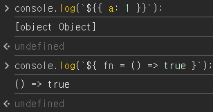
이 때 사용할 수 있는 게 Tagged Template Literal 문법이다. 다음은 간단 예제이다.
const red = '빨간색';
const blue = '파란색';
function favoriteColors(texts, ...values) {
  console.log(texts);
  console.log(values);
}
favoriteColors`제가 좋아하는 색은 ${red}과 ${blue}입니다.`
원래 함수의 첫번째 인자가 문자열의 배열을, 나머지 인자들이 ${}안의 값을 포함하지만 rest 문법을 사용하여 두 배열로 나타냈다.
위 코드에서 발생한 값들을 조합하여 다음과 함수가 특정 문자열을 반환하게 해줄 수도 있다. 함수에 return 을 추가하면 주석에 써져있는 문자열을 반환한다.
return texts.reduce((result, text, i) => `${result}${text}${values[i] ? `<b>${values[i]}</b>` : ''}`, '');
//제가 좋아하는 색은 <b>빨간색</b>과 <b>파란색</b>입니다.
객체가 아닌 함수를 넣는 것도 가능하다.
function sample(texts, ...fns) {
    const mockProps = {
      title: '안녕하세요',
      body: '내용은 내용내용 입니다.'
    };
    return texts.reduce((result, text, i) => `${result}${text}${fns[i] ? fns[i](mockProps) : ''}`, '');
  }
  console.log(sample`
    제목: ${props => props.title}
    내용: ${props => props.body}
  `)
위의 두 코드가 어떻게 작동하는지 완벽히 이해할 수 없었지만 우선은 넘어갔다.
styled-components 를 사용하기 위해 우선 styling-with-styled-components 라는 이름의 프로젝트를 만들고 styled-components 를 설치한다.
$npx create-react-app styling-with-styled-components$yarn add styled-components
styled-components 를 익히기 위해 App.js 를 다음과 같이 작성해보자. 검은 원을 만드는 간단한 예제이다.
import React from 'react';
import styled from 'styled-components';

const Circle = styled.div`
  width: 5rem;
  height: 5rem;
  background: black;
  border-radius: 50%;
`;

function App() {
  return <Circle />;
}

export default App;
styled-components 를 사용하면 이렇게 스타일을 입력함과 동시에 해당 스타일을 가진 컴포넌트를 만들 수 있다. styled.div, input 이나 styled.input 처럼 다른 태그들도 사용 가능하다.
이렇게 만든 컴포넌트에 props를 주는 것도 가능하다.
Circle 컴포넌트에 color props를 넣어보자.
import React from 'react';
import styled from 'styled-components';

const Circle = styled.div`
  width: 5rem;
  height: 5rem;
  background: ${props => props.color || 'black'};
  border-radius: 50%;
`;

function App() {
  return <Circle color="blue" />;
}

export default App;
1-6에서 사용했던 단축 평가 논리 계산법을 활용해 color라는 props가 없으면 검은색이 되게 해두었다.
huge 라는 props가 설정됐을 때 원의 크기를 키워주는 작업을 해보자.
import React from 'react';
import styled, { css } from 'styled-components';

const Circle = styled.div`
  width: 5rem;
  height: 5rem;
  background: ${props => props.color || 'black'};
  border-radius: 50%;
  ${props =>
    props.huge &&
    css`
      width: 10rem;
      height: 10rem;
    `}
`;

function App() {
  return <Circle color="red" huge />;
}

export default App;
2번째 줄에서 css를 불러온 것을 볼 수 있는데 huge를 처리할 때 처럼 여러 줄의 css 코드를 조건부로 보여주기 위해서는 css를 불러와야 한다.
Sass를 배울 때 만들었던 Button 컴포넌트를 styed-components 를 통해 다시 제작해보자.
import React from 'react';
import styled from 'styled-components';

const StyledButton = styled.button`
  display: inline-flex;
  height: 2.25rem;
  font-size: 1rem;
  background: #228be6;
`;

function Button({ children, ...rest }) {
    return <StyledButton {...rest}>{children}</StyledButton>;
}

export default Button;
import React from 'react';
import styled from 'styled-components';
import Button from './components/Button';
const AppBlock = styled.div`
width: 512px;
margin: 0 auto;
margin-top: 4rem;
border: 1px solid black;
padding: 1rem;
`;
function App() {
return (
<AppBlock>
<Button>BUTTON</Button>
</AppBlock>
);
}
export default App;
코드가 너무 길어지는 것 같아 원래 나와있던 예제의 몇몇 부분 삭제하였다.
여기에 Sass를 사용할 때 썼던 darken(), lighten() 같은 유틸함수를 위해 polished 라이브러리를 설치하여 색상에 변화를 주었다.
$yarn add polishedimport React from 'react';
import styled from 'styled-components';
import { darken, lighten } from 'polished';
const StyledButton = styled.button`
display: inline-flex;
height: 2.25rem;
font-size: 1rem;
background: #228be6;
&:hover {
background: ${lighten(0.1, '#228be6')};
}
&:active {
background: ${darken(0.1, '#228be6')};
}
`;
function Button({ children, ...rest }) {
return <StyledButton {...rest}>{children}</StyledButton>;
}
export default Button;
색상을 보다 쉽게 관리하기 위해 색상 코드를 지닌 변수를 Button.js에서 선언하는 대신 ThemeProvider 라는 기능을 사용하여 styled-components 로 만드는 모든 컴포넌트에서 조회하여 사용 할 수 있는 전역적인 값을 설정할 수 있다.
App.js를 다음과 같이 수정한다.
function App() {
  return (
    <ThemeProvider
      theme={{
        palette: {
          blue: '#228be6',
          gray: '#495057',
          pink: '#f06595'
        }
      }}
    >
      <AppBlock>
        <Button>BUTTON</Button>
      </AppBlock>
    </ThemeProvider>
  );
}
이렇게 theme을 설정하면 ThemeProvider 내부에 렌더링된 styled-components 로 만든 다른 컴포넌트에서도 palette를 조회하여 사용 할 수 있다.
Button.js 의 StyledButton 을 다음과 같이 수정해도 변하는 게 없음을 알 수 있다.
const StyledButton = styled.button`
  display: inline-flex;
  height: 2.25rem;
  font-size: 1rem;

  ${props => {
        const selected = props.theme.palette.blue;
        return css`
      background: ${selected};
      &:hover {
        background: ${lighten(0.1, selected)};
      }
      &:active {
        background: ${darken(0.1, selected)};
      }
    `;
    }}

  & + & {
    margin-left: 1rem;
  }
`;
여기서 selected 값을 보면 무조건 blue로 설정되어 있는데 이를 props로 받아올 color 값으로 수정하고, color의 기본값을 blue로 설정하게 수정한다.
const selected = props.theme.palette[props.color];

//중략

Button.defaultProps = {
    color: 'blue'
  };
이후 App.js에서 Button 컴포넌트를 여러개 렌더링하면 다음과 같은 결과가 출력된다.

또한 props.theme.palette.blue 같이 조회하는 게 아닌 비구조화 할당을 통해 코드 가독성을 높여줄 수 있다.
${({ theme, color }) => {
    const selected = theme.palette[color];
    return css`
      background: ${selected};
      &:hover {
        background: ${lighten(0.1, selected)};
      }
      &:active {
        background: ${darken(0.1, selected)};
      }
이후 코드의 유지보수를 편하게 하기 위해 색상 부분을 분리해준다.
const colorStyles = css`
  ${({ theme, color }) => {
        const selected = theme.palette[color];
        return css`
      background: ${selected};
      &:hover {
        background: ${lighten(0.1, selected)};
      }
      &:active {
        background: ${darken(0.1, selected)};
      }
    `;
    }}
`;

const StyledButton = styled.button`
  display: inline-flex;
  height: 2.25rem;
  font-size: 1rem;

  ${colorStyles}

  & + & {
    margin-left: 1rem;
  }
`;
위 내용들을 통해 size, outline, fullwidth 같은 속성들도 추가하여 여러 모양의 버튼을 제작하였다.
import React from 'react';
import styled, { ThemeProvider } from 'styled-components';
import Button from './components/Button';

const AppBlock = styled.div`
  width: 512px;
  margin: 0 auto;
  margin-top: 4rem;
  border: 1px solid black;
  padding: 1rem;
`;

const ButtonGroup = styled.div`
  & + & {
    margin-top: 1rem;
  }
`;

function App() {
  return (
    <ThemeProvider
      theme={{
        palette: {
          blue: '#228be6',
          gray: '#495057',
          pink: '#f06595'
        }
      }}
    >
      <AppBlock>
        <ButtonGroup>
          <Button size="large">BUTTON</Button>
          <Button>BUTTON</Button>
          <Button size="small">BUTTON</Button>
        </ButtonGroup>
        <ButtonGroup>
          <Button color="gray" size="large">
            BUTTON
          </Button>
          <Button color="gray">BUTTON</Button>
          <Button color="gray" size="small">
            BUTTON
          </Button>
        </ButtonGroup>
        <ButtonGroup>
          <Button color="pink" size="large">
            BUTTON
          </Button>
          <Button color="pink">BUTTON</Button>
          <Button color="pink" size="small">
            BUTTON
          </Button>
        </ButtonGroup>
        <ButtonGroup>
          <Button size="large" outline>
            BUTTON
          </Button>
          <Button color="gray" outline>
            BUTTON
          </Button>
          <Button color="pink" size="small" outline>
            BUTTON
          </Button>
        </ButtonGroup>
        <ButtonGroup>
          <Button size="large" fullWidth>
            BUTTON
          </Button>
          <Button size="large" color="gray" fullWidth>
            BUTTON
          </Button>
          <Button size="large" color="pink" fullWidth>
            BUTTON
          </Button>
        </ButtonGroup>
      </AppBlock>
    </ThemeProvider>
  );
}

export default App;
import React from 'react';
import styled, { css } from 'styled-components';
import { darken, lighten } from 'polished';
const colorStyles = css`
${({ theme, color }) => {
const selected = theme.palette[color];
return css`
background: ${selected};
&:hover {
background: ${lighten(0.1, selected)};
}
&:active {
background: ${darken(0.1, selected)};
}
${props =>
props.outline &&
css`
color: ${selected};
background: none;
border: 1px solid ${selected};
&:hover {
background: ${selected};
color: white;
}
`}
`;
}}
`;
const sizes = {
large: {
height: '3rem',
fontSize: '1.25rem'
},
medium: {
height: '2.25rem',
fontSize: '1rem'
},
small: {
height: '1.75rem',
fontSize: '0.875rem'
}
};
const sizeStyles = css`
${({ size }) => css`
height: ${sizes[size].height};
font-size: ${sizes[size].fontSize};
`}
`;
const fullWidthStyle = css`
${props =>
props.fullWidth &&
css`
width: 100%;
justify-content: center;
& + & {
margin-left: 0;
margin-top: 1rem;
}
`}
`;
const StyledButton = styled.button`
display: inline-flex;
height: 2.25rem;
font-size: 1rem;
margin-right: 1rem;
${sizeStyles}
${colorStyles}
${fullWidthStyle}
`;
function Button({ children, color, size, outline, fullWidth, ...rest }) {
return (
<StyledButton
color={color}
size={size}
outline={outline}
fullWidth={fullWidth}
{...rest}
>
{children}
</StyledButton>
);
}
Button.defaultProps = {
color: 'blue',
size: 'medium'
};
export default Button;
기존 화면을 가리면서 정보를 보여주는 Dialog 컴포넌트를 만들어보자.
우선 필요없는 코드를 모두 지워 삭제하기 버튼 하나만 남겨두었다.

그리고 Dialog라는 컴포넌트를 다음과 같이 작성한다.
import React from 'react';
import styled from 'styled-components';
import Button from './Button';

const DarkBackground = styled.div`
  position: fixed;
  left: 0;
  top: 0;
  width: 100%;
  height: 100%;
  display: flex;
  align-items: center;
  justify-content: center;
  background: rgba(0, 0, 0, 0.8);
`;

const DialogBlock = styled.div`
  width: 320px;
  padding: 1.5rem;
  background: white;
  border-radius: 2px;
  h3 {
    margin: 0;
    font-size: 1.5rem;
  }
  p {
    font-size: 1.125rem;
  }
`;

const ButtonGroup = styled.div`
  margin-top: 3rem;
  display: flex;
  justify-content: flex-end;
`;

function Dialog({ title, children, confirmText, cancelText }) {
  return (
    <DarkBackground>
      <DialogBlock>
        <h3>{title}</h3>
        <p>{children}</p>
        <ButtonGroup>
          <Button>{cancelText}</Button>
          <Button>{confirmText}</Button>
        </ButtonGroup>
      </DialogBlock>
    </DarkBackground>
  );
}

Dialog.defaultProps = {
  confirmText: '확인',
  cancelText: '취소'
};

export default Dialog;
이후 App.js에 렌더링 하면 다음과 같이 모달이 계속 생성되어있다.

그런데 취소 버튼과 삭제 버튼의 사이를 더 좁 변경하고 싶다. 이럴 때에는 기존 스타일에 덮어쓰면 된다.
const ShortMarginButton = styled(Button)`
  & + & {
    margin-left: 0.5rem;
  }
`;
이렇게 새로운 스타일을 만든 후 버튼을 <Button>이 아닌 <shortMarginButton>으로 만들어주면 된다.
이제 이 컴포넌트가 삭제하기 버튼을 누르면 등장하고, 취소나 삭제 버튼을 누르면 사라지게 만들어보자.
우선 Dialog 에서 onConfirm 과 onCancel 을 props 로 받아오도록 하고 해당 함수들을 각 버튼들에게 onClick 으로 설정한다. 그리고 visible props 값이 false 일 때 컴포넌트에서 null 을 반환하도록 설정한다.
function Dialog({
  title,
  children,
  confirmText,
  cancelText,
  onConfirm,
  onCancel,
  visible
}) {
  if (!visible) return null;
  return (
    <DarkBackground>
      <DialogBlock>
        <h3>{title}</h3>
        <p>{children}</p>
        <ButtonGroup>
          <ShortMarginButton color="gray" onClick={onCancel}>
            {cancelText}
          </ShortMarginButton>
          <ShortMarginButton color="pink" onClick={onConfirm}>
            {confirmText}
          </ShortMarginButton>
        </ButtonGroup>
      </DialogBlock>
    </DarkBackground>
  );
}
이후 App컴포넌트에서 useState 를 사용하여 Dialog 를 가시성 상태를 관리한다.
const [dialog, setDialog] = useState(false);
  const onClick = () => {
    setDialog(true);
  };
  const onConfirm = () => {
    console.log('확인');
    setDialog(false);
  };
  const onCancel = () => {
    console.log('취소');
    setDialog(false);
  };

  //...

<Button size="large" color="pink" fullWidth onClick={onClick}>
삭제
</Button>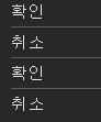
콘솔 창에서 잘 작동하는 것을 확인할 수 있다.
이제 트랜지션을 구현해보자. 트랜지션 효과를 적용 할 때에는 CSS Keyframe 을 사용하며, styled-components 에서 이를 사용 할 때에는 keyframes 라는 유틸을 사용한다.
Dialog가 나타날 때 DarkBackground 쪽에는 서서히 나타나는 fadeIn 효과를 주고, DialogBlock 에는 아래에서부터 위로 올라오는 효과를 보여주는 slideUp 효과를 줘보도록 하자.
const fadeIn = keyframes`
  from {
    opacity: 0
  }
  to {
    opacity: 1
  }
`;

const slideUp = keyframes`
  from {
    transform: translateY(200px);
  }
  to {
    transform: translateY(0px);
  }
`;

const DarkBackground = styled.div`
  position: fixed;
  left: 0;
  top: 0;
  width: 100%;
  height: 100%;
  display: flex;
  align-items: center;
  justify-content: center;
  background: rgba(0, 0, 0, 0.8);

  animation-duration: 0.25s;
  animation-timing-function: ease-out;
  animation-name: ${fadeIn};
  animation-fill-mode: forwards;
`;

const DialogBlock = styled.div`
  width: 320px;
  padding: 1.5rem;
  background: white;
  border-radius: 2px;
  h3 {
    margin: 0;
    font-size: 1.5rem;
  }
  p {
    font-size: 1.125rem;
  }

  animation-duration: 0.25s;
  animation-timing-function: ease-out;
  animation-name: ${slideUp};
  animation-fill-mode: forwards;
`;
이렇게 하면 컴포넌트가 나타날 때 트랜지션 효과가 나타나게 된다.
사라지는 효과를 구현하려면 Dialog 컴포넌트에서 두개의 로컬 상태를 관리해주어야 한다. 하나는 현재 트랜지션 효과를 보여주고 있는 중이라는 상태를 의미하는 animate, 나머지 하나는 실제로 컴포넌트가 사라지는 시점을 지연시키기 위한 localVisible 값이다.
그리고 useEffect 를 하나 작성해주어야 하는데 visible 값이 true 에서 false 로 바뀌는 시점을 감지하여 animate 값을 true 로 바꿔주고 setTimeout 함수를 사용하여 250ms 이후 false로 바꾸어 주어야 한다.
또한 !visible 조건에서 null 를 반환하는 대신에 !animate && !localVisible 조건에서 null 을 반환하도록 수정해주어야 한다.
 useEffect(() => {
    // visible 값이 true -> false 가 되는 것을 감지
    if (localVisible && !visible) {
      setAnimate(true);
      setTimeout(() => setAnimate(false), 250);
    }
    setLocalVisible(visible);
  }, [localVisible, visible]);

if (!animate && !localVisible) return null;
이제 DarkBackground 와 DialogBlock 에 disappear 라는 props 를 주어서 사라지는 효과가 나타나도록 설정하면 된다.
const DarkBackground = styled.div`
  position: fixed;
  left: 0;
  top: 0;
  width: 100%;
  height: 100%;
  display: flex;
  align-items: center;
  justify-content: center;
  background: rgba(0, 0, 0, 0.8);

  animation-duration: 0.25s;
  animation-timing-function: ease-out;
  animation-name: ${fadeIn};
  animation-fill-mode: forwards;

  ${props =>
    props.disappear &&
    css`
      animation-name: ${fadeOut};
    `}
`;

const DialogBlock = styled.div`
  width: 320px;
  padding: 1.5rem;
  background: white;
  border-radius: 2px;
  h3 {
    margin: 0;
    font-size: 1.5rem;
  }
  p {
    font-size: 1.125rem;
  }

  animation-duration: 0.25s;
  animation-timing-function: ease-out;
  animation-name: ${slideUp};
  animation-fill-mode: forwards;

  ${props =>
    props.disappear &&
    css`
      animation-name: ${slideDown};
    `}
`;'WINK-(Web & App) > React.js 스터디' 카테고리의 다른 글
| [2024 React.js 스터디] 김지나 #7주차 (0) | 2024.06.02 |
|---|---|
| [2024 React.js 스터디] 이서영 #6주차 (0) | 2024.05.28 |
| [2024 React.js 스터디] 박건민 #6주차 (0) | 2024.05.28 |
| [2024 React.js 스터디] 한승훈 #6주차 (1) | 2024.05.28 |
| [2024 React.js 스터디] 김지나 #6주차 (0) | 2024.05.28 |


